

BY ROB
Another season, another batch of team kits for us to run our objective eyes over. The jersey is an integral part of any team or sport – not only does it identify you on the field but it is arguably the most unifying element between fans and players. Let’s see if these new strips muster up.

“Ah, geez. And you got the stink lines and everything.” This strip dead set looks like the graphic design intern at ASICS had some sort of mishap trying to get the bottom half nice and level and no-one proofing it either cared or noticed. At least the major sponsor isn’t in eye-searing red like some others.
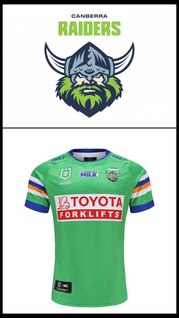
Possibly the weirdest thing about the Green Machine gear in ’23 is the paucity of sponsorship on it. You’ve got forklifts screaming at you from the front and more bloody sports gambling on the back. At least they found room for the Milk. As to the actual design of the jersey itself this one is quite subdued – just ACT armbands and a 1993-era homage on the collar.
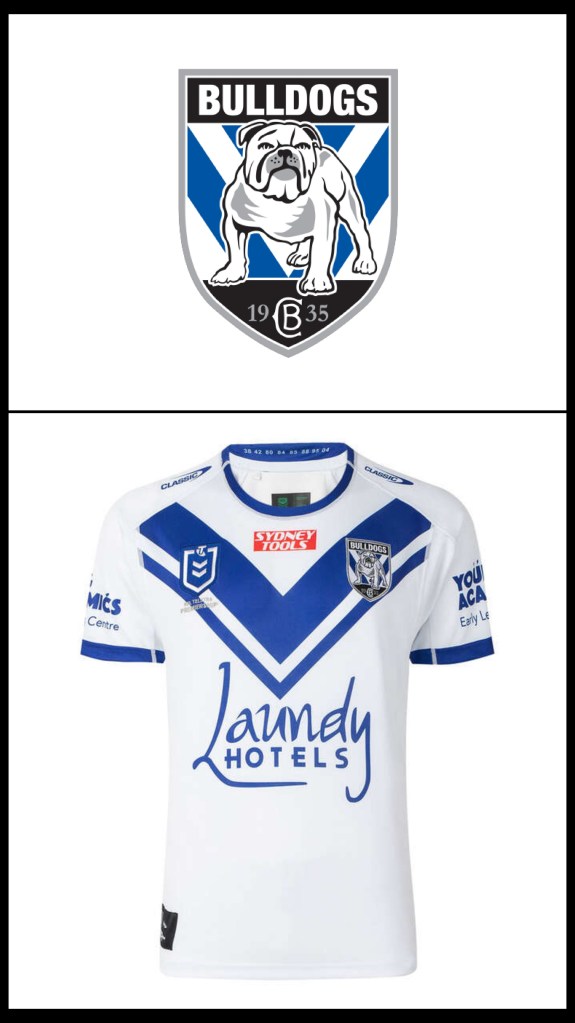
I’m convinced somewhere inside NRL headquarters there’s a document that mandates that at least one team must be sponsored by a hotel chain. This is a very minimal Dogs jersey – the chevron only covers the chest panel, made more noticeable now that the shoulders are solid white with blue cuffs.
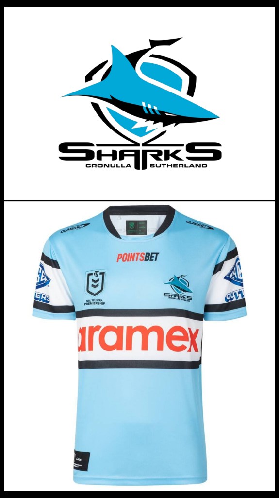
Every year of Aramex sponsorship we ask the question “Who are Aramex?” It’s only after a quick google that we remember their previous name as Fastway couriers (a business so bad they once lost some sneakers Rob ordered). The jersey is standard issue Sharks stuff, but they’ve managed to cram gambling in to make it worse.

Finally a jersey that makes it look like Titans players are slowly drowning in a giant inkwell. This has to be the most insipid jersey the Gold coast has ever thrown up, clearly manmade because AI would never have the imagination to produce something so awful. For added extra ickiness their sponsor is a payday lender, which is possibly the only thing worse than gambling on official kit.

The jersey that launched a thousand coke can memes. If you can drag your eyes away from the ludicrously sized Kings logo you may be able to see the faint outline of a dolphin lost in a sea of red. The nearly horizontal chevrons give the whole thing a BCF fishing shirt vibe, which is pretty apt.
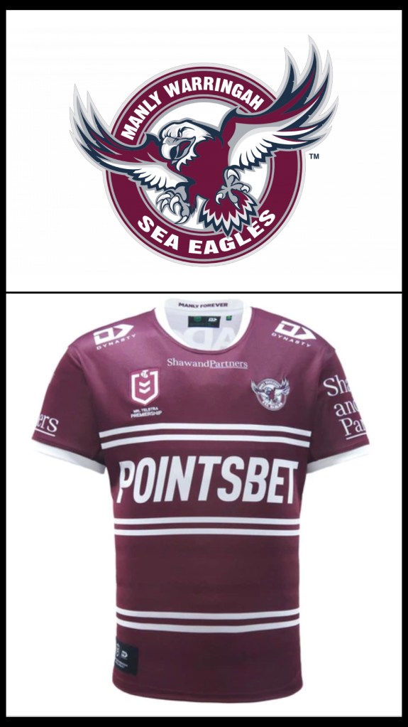
The Sea-eagles seven can take solace in knowing that nothing on the regular jersey goes against the good book. Absolutely nothing. The jersey itself is so basic it must be a free clipart template coloured in.

One day designers will realise that gradient hues on jerseys are a sin, but until that day we’re left with things like the Storm effort for 2023. The extremely thin chevrons and cuff lines don’t help either. Also it’s not often that a main sponsor needs a tagline but when your product is semi-niche you have to let people know.
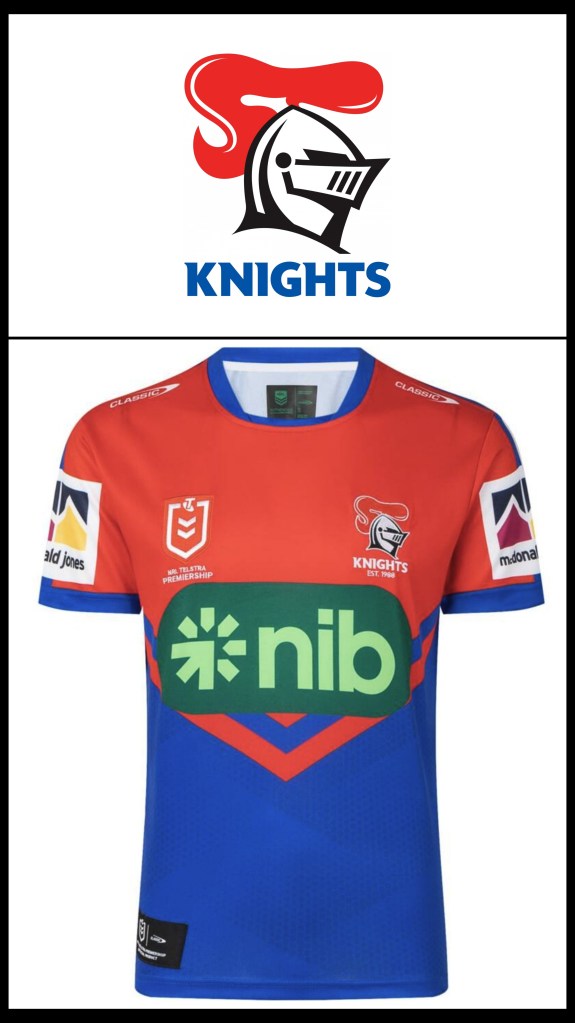
Much like the Raiders and Canberra Milk in ’21 the Knights have returned to the warm embrace of nib for this years campaign. It’s fitting that the nib logo is a spin on the buffering animation given the football purgatory the Knights are trapped in. The jersey itself continues the theme of doing the least amount of work during the design phase and then hurriedly sticking sponsor logos on. Oh look, more chevrons.

“Can you take the basic elements of the Cows jersey but make it really dour and forlorn?” I imagine that was the conversation during the design brief. I should start deducting points for chevrons unless they’re given a unique spin. This strip makes me dead inside.

Minus a point for the chevrons (but at least they’ve kind of done them well). If you don’t know what one.nz it’s actually the rebrand for Vodafone in NZ, and their logo makes it look like every player now has a new version of Ironmans arc reactor in their chest. The always fun Warriors logo absolutely pops (take hint Dolphins).
Nothing says strength and defensive integrity like having your traditional golden bands crumble into nothingness as they approach the middle of your chest. There is a delicious irony in having a jersey sponsored by a construction firm looking like a building project that collapsed midway.

Apart from the mid-chest gradient this jersey zings. The sponsor logos are instep with the overall palette and the colour trim is bright but not too oversized.

I like the inverted Bunnies logo, although the MG Motor under a giant MG logo feels redundant. If the Bunnies ever have a need to ditch myrtle and cardinal hoops I’m sure they’ll let us know.

Sometimes I wonder about the identity crisis the Dragons would experience if St George bank ever collapsed, but then I realise that the bank will almost certainly outlast the club. If you need a rundown of this jersey then you must have never seen a Dragons jersey in your life.

If you were to place the Roosters ’22 and ’23 jerseys side by side you’d come to one of two conclusions: either the Roosters forgot to pay the invoice for their ’22 design or they got seriously overcharged for the ’23 job. If you’re going to use the word “refinement” it definitely needs quotation marks.
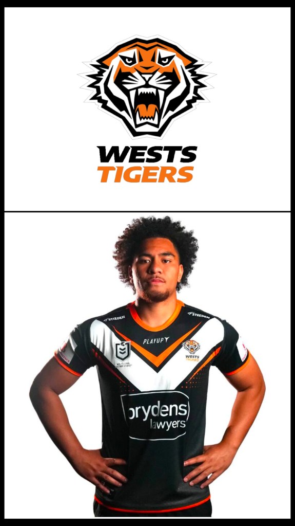
You can always tell who has the upper hand in a merger club by looking at the jersey. They might be Tigers in name and logo but this jersey is almost completely in Magpies territory, with just a glimmer of orange hinting at their big cat pedigree. The upside of this is the law firm sponsor logo is much less intrusive. The fact that they have accents for their chevron negates the point they lose for having it in the first place.
So there you have it, the 2023 fashion collection for NRL tragics. It’s a pretty middling-to-meh bunch of designs and one can only hope that some of these strips have a bit more spark and ingenuity in 2024.
Like our page on Facebook, follow us on Twitter, or share this on social media and I’ll give you a lollypop. Don’t hesitate to send us feedback (dan@sportress.org) or comment below if you want to call us names.
