BY ROB
It’s January, which means two things – England is destroying Australia in the ODI series, and the 2018 NRL is drawing near. As is customary at the Sportress I have returned from my Summer writing break to peruse what the NRL clubs have to offer by way of On-field fashion. Some of it is good, and some of it is so dull the respective clubs should be fined for a wilful lack of imagination. Now, dear readers, let’s press on!
Brisbane Broncos
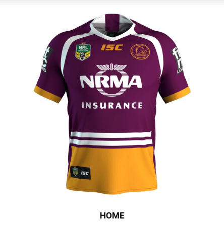
For their home strip the Broncs have stuck with their two-tone maroon and gold, replete with white trim and a spanking big NRMA logo in the middle, just in case you didn’t know that the NRMA was their main jersey sponsor. This year the Broncos have decided to put their logo inside a circle for that lovely retro look, which tells you exactly how exciting this get up is…
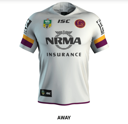
The away jersey is a simple inversion of the home design, except that all those tricky third party deals meant that they ran out of money to transfer the rest of the trim in black ink. But still, Circle Logo!
Canberra Raiders
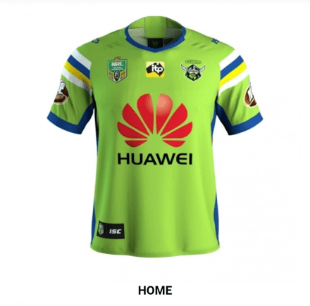
The Raiders have cleverly saved money by changing ABSOLUTELY NOTHING from the 2017 strip, except getting one of the work experience kids to sew on ITP logos above the totally inconspicuous Huawei symbol. You’ll See Green (and a bit of red too)!
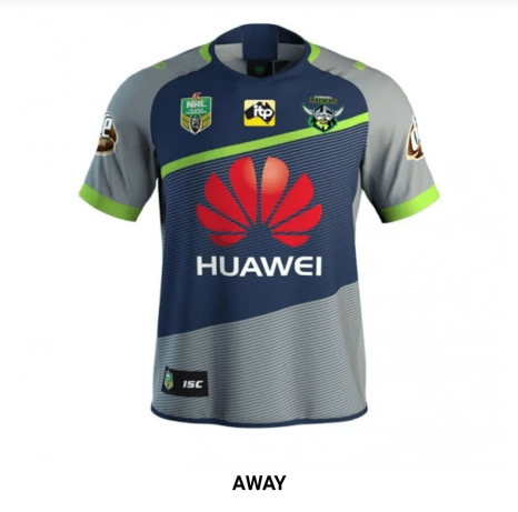
The Raiders have actually saved even more money by deploying this training jersey as their away strip, which also means that they can warm up in their official game gear and not have to bother with getting one of the trainers to peel it off them before they take the field. Gold!
Canterbury-Bankstown Bulldogs
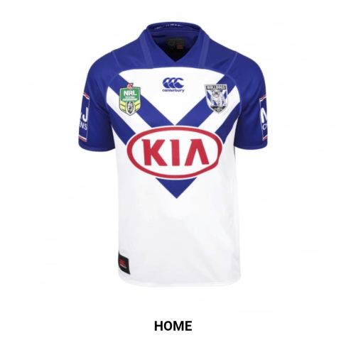
The Bulldogs went all out and hired their 2017 designer to finish the job he started – adding the tip of the blue V underneath the KIA logo. Also, guess what? Big Red Logos are still cool, which is why 1 in every three teams has one.
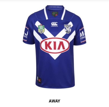
Take your home jersey and invert it using Photoshop. Voila!
Cronulla Sharks
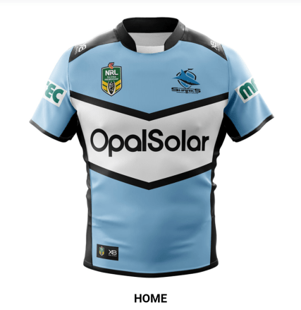
This is actually pretty good by the Sharkies – the white wedge is well placed and the sponsor fits in with the colour scheme.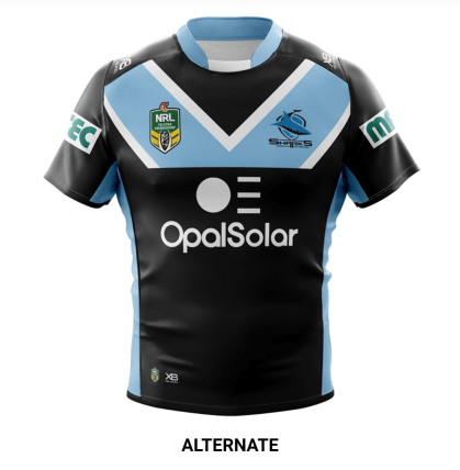
The genius of the away strip is that it actually is a fabric solar panel, allowing sharks players to soak up extra energy during day games, now that they can’t use those peptides anymore.
Manly Sea-Eagles
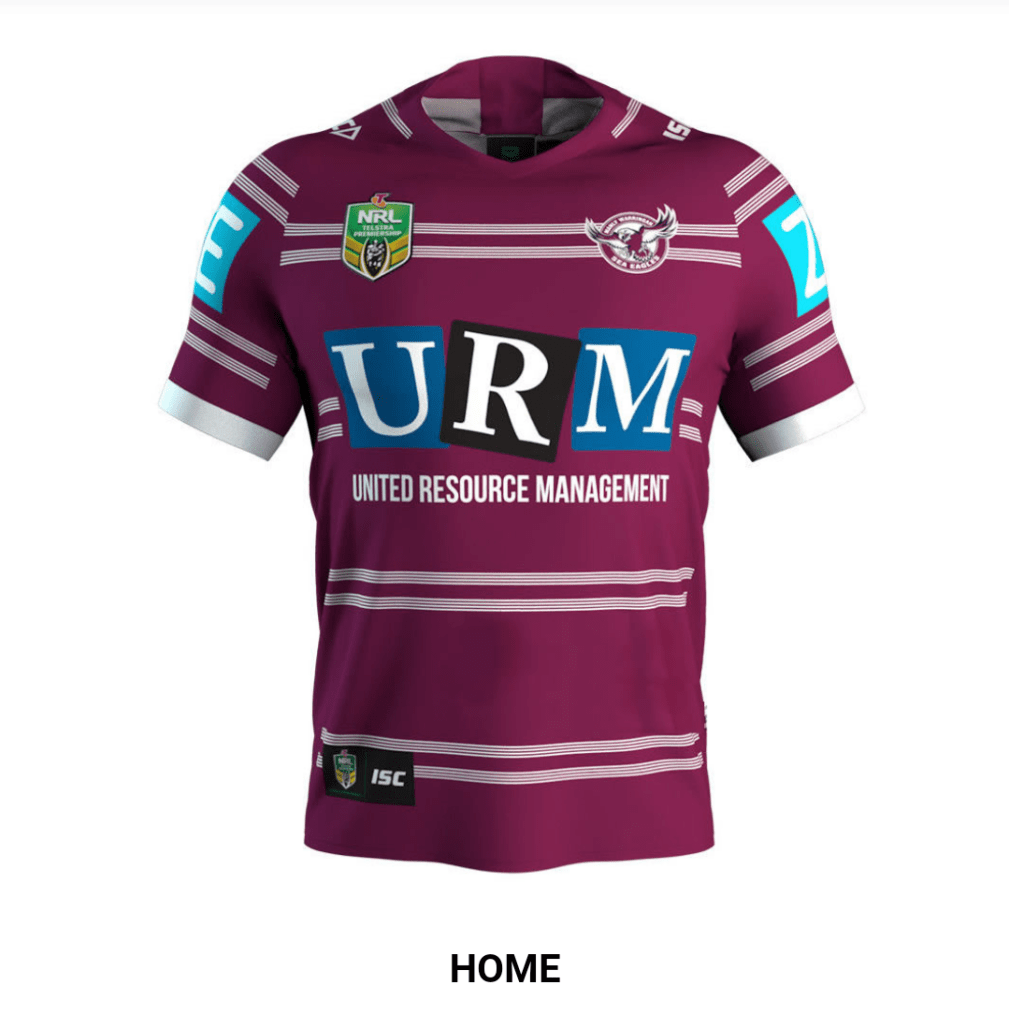
It’s highly appropriate that Manly still have the name of a waste resource company splashed across their torso, as they are themselves a wasted resource.
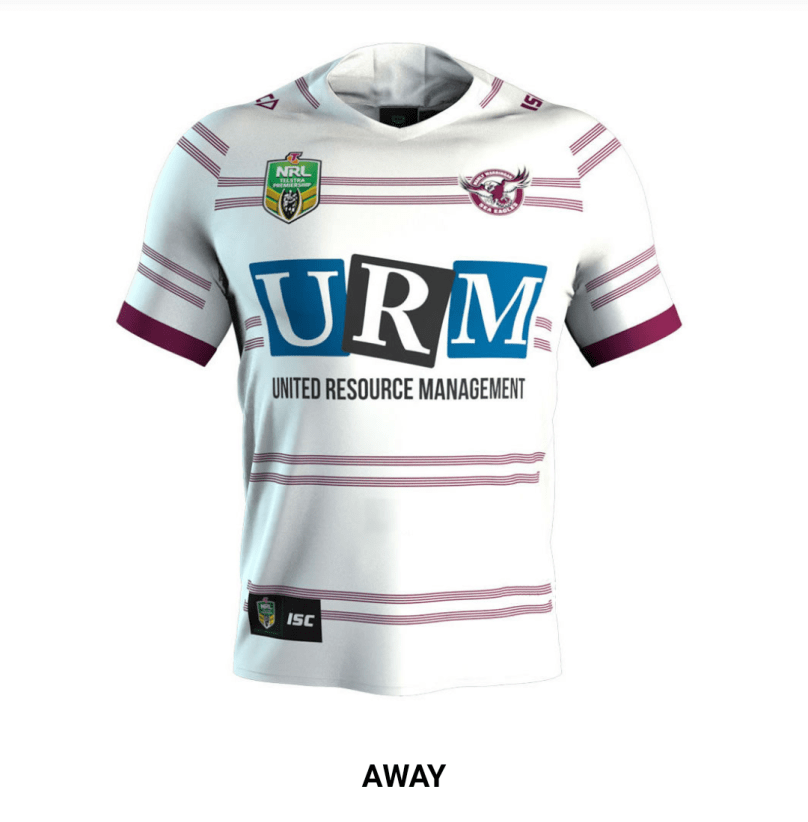
Really Manly, really?
Melbourne Storm
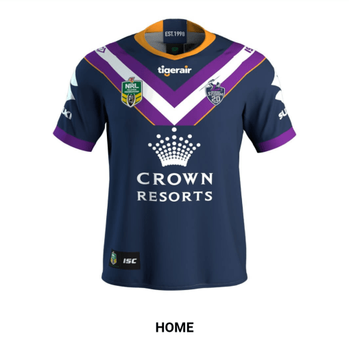
The Storm Jersey actually has a very strong narrative – you go to Melbourne, visit Crown Casino, lose all your money and then are forced to fly home on Tigerair. When you get home you have to sell your Suzuki Swift to cover all your debts.
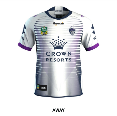
Melbourne Storm “Venetian Blinds” Edition. Great.
New Zealand Warriors
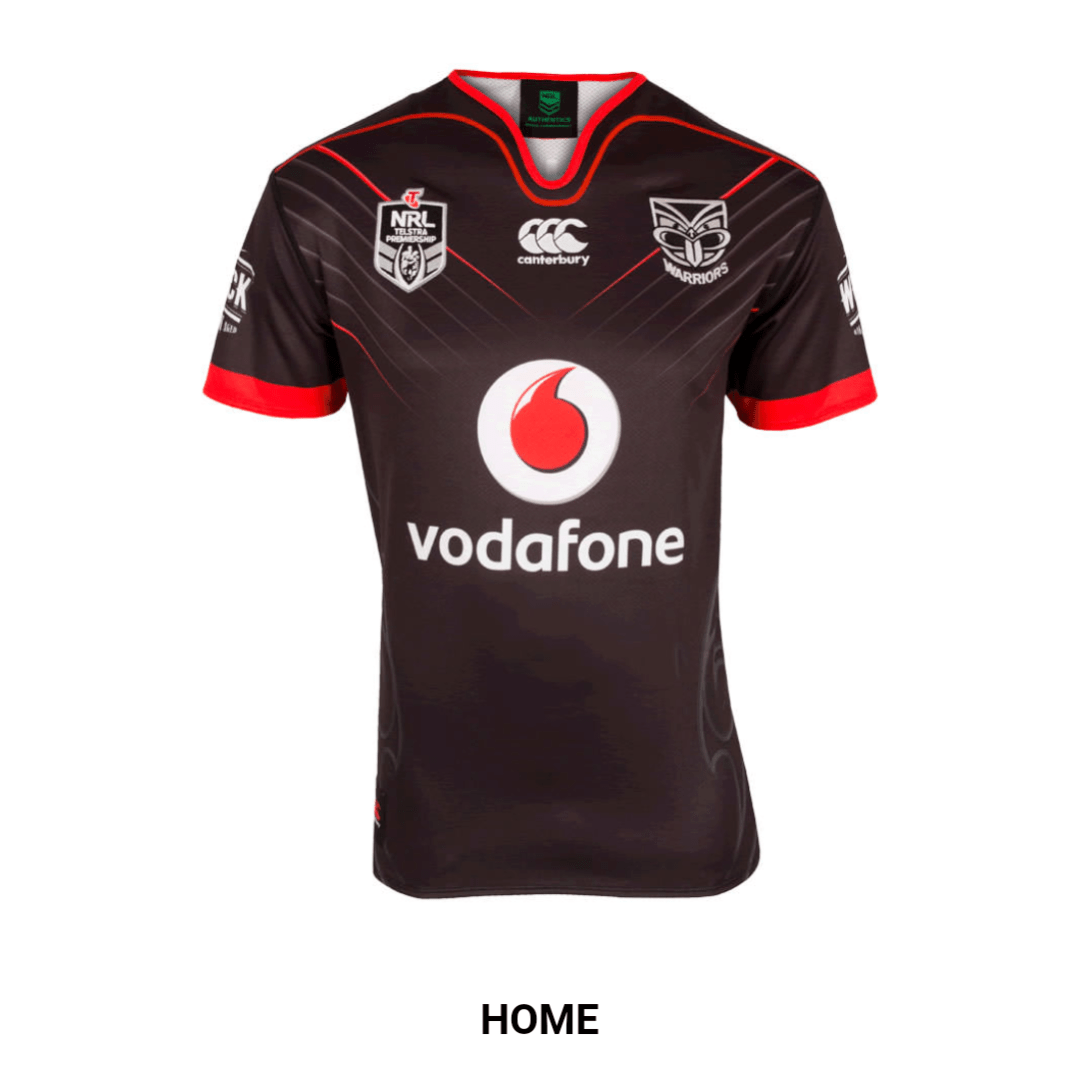
The Warriors jersey tells us two things – no one at Canterbury has any design sense, and Vodafone somehow still have enough money to sponsor a team, but not update their own logo.

Is there a mythical seven clawed monster in New Zealand that goes around clawing footballers across the chest? Is Vodafone worried that people may not instantly recognise their logo (the whole point of a logo is that you don’t then need to write your name in big letters underneath it).
Newcastle Knights
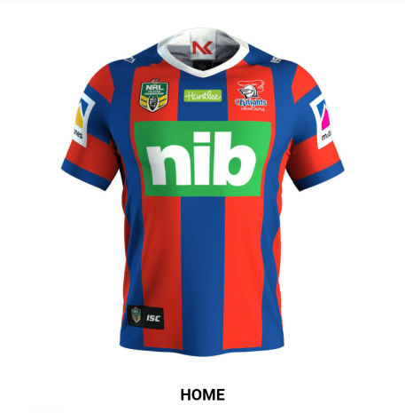
Surprisingly not a terrible design – Also nib reminds me of Paul Harragon, which in turn reminds me of when the Knights were good. Maybe it’ll remind them too?
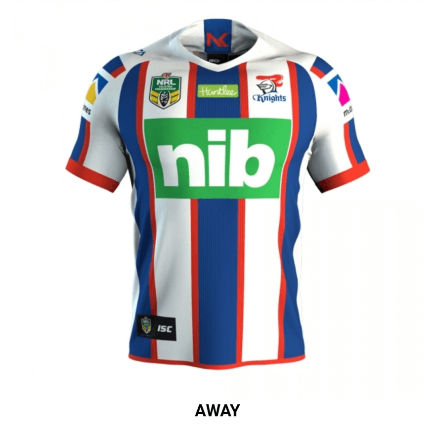
Red edging! Wow, the technology of 2018 never ceases to amaze.
North Queensland Cowboys
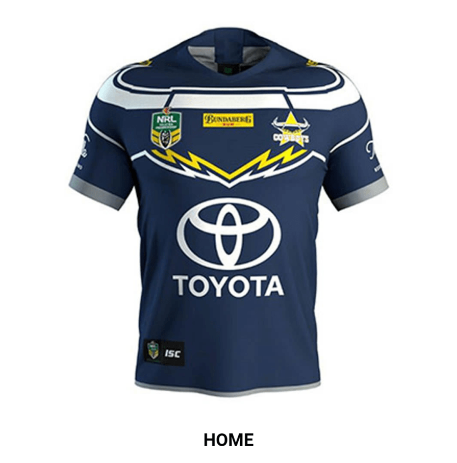
The Cows have already won 2018, at least in the fashion stakes. The way those horns wrap around the shoulders. The way in which the Steers forelock is made out of lightning bolts. The way in which the giant car logo is NOT red.
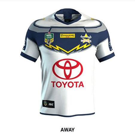
Well it’s not red on the home strip.
Parramatta Eels
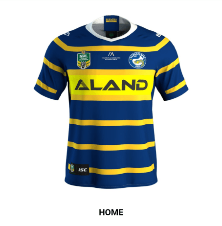
The Eels 2017 jersey was an inspired retro throwback – this just looks as though someone’s ducked into the offices of the western wanderers and screenshotted their design to send off to ISC. We’ll have that in blue and yellow please.
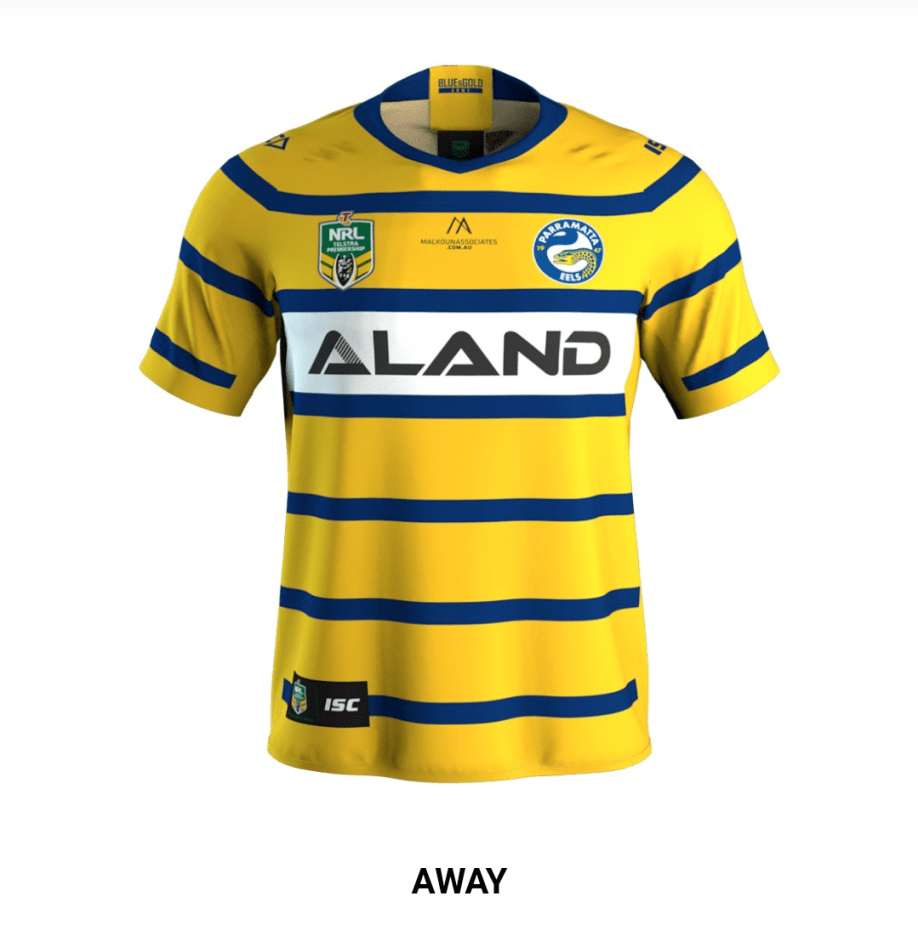
An inverted jersey!? Mind blown!
Penrith Panthers
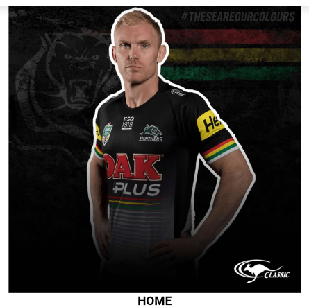
The Panthers two-step plan for football domination – recruit talented players, and then design jersey that will obliterate the eyesight of their opponents. It’s like a board member with poor fashion sense picked out their favourite bits from each era and glued them onto Peter Wallace.
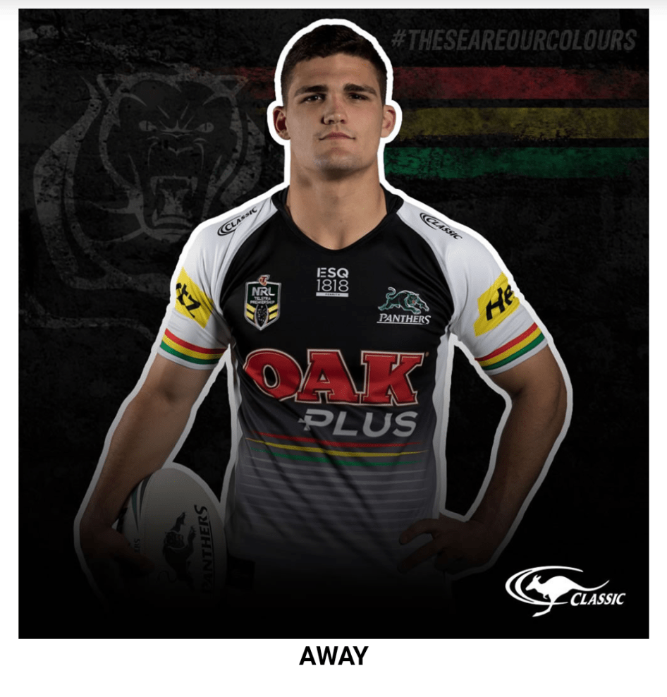
White sleeves!? Avant Garde!
South Sydney Rabbitohs
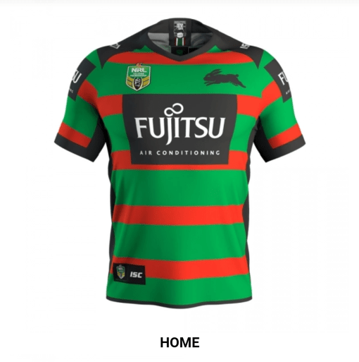
Well, if it ain’t broke, don’t fix it.
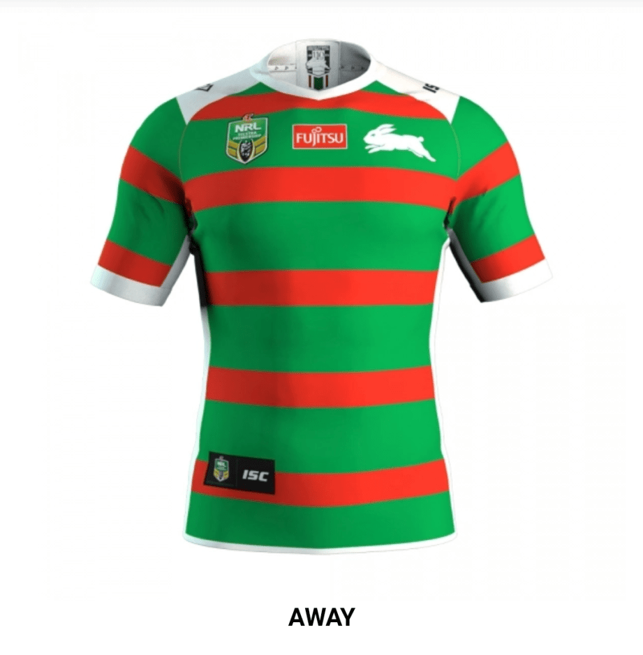
You should probably fix this though – quick, what’s Rustys next film release?
St George- Illawarra Dragons
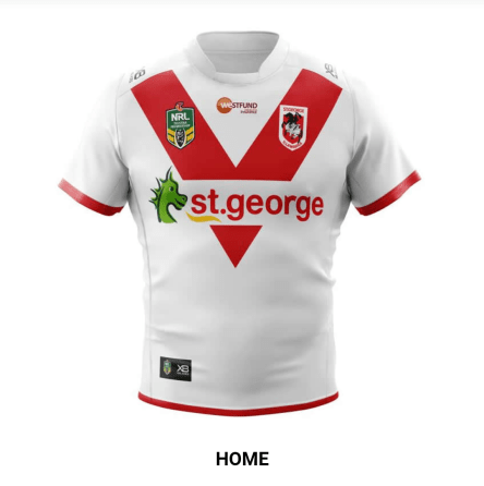
How did you even think to put the sponsor across the Red V? Give that designer a bonus!
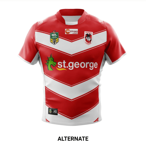
In all fairness though the Dragons do win the best away strip award – the chevrons allude to the Steelers history, and it’s just a strong, simple design.
Sydney Roosters
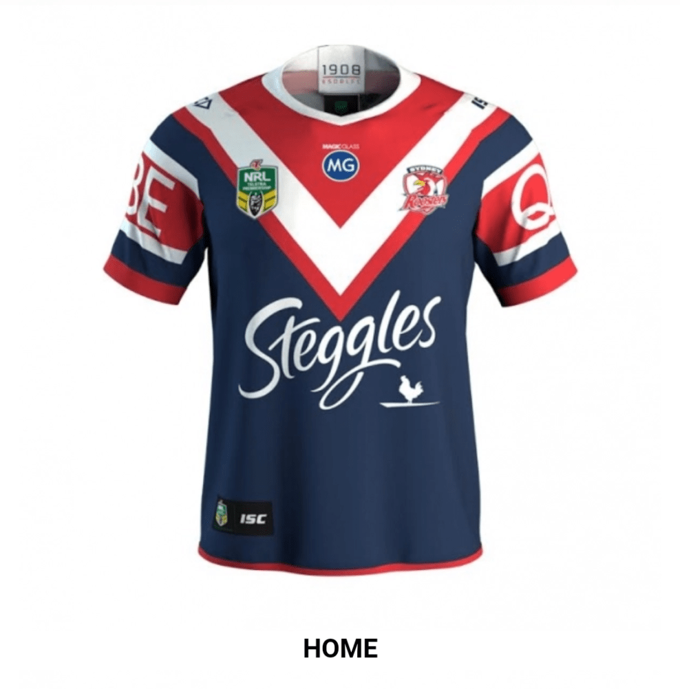
I was kinda hoping the Steggles logo would just be replaced by Cooper Cronk’s headshot. According to the blue spot on the chest the Roosters are now also sponsored by either a car company or Mark Geyer.
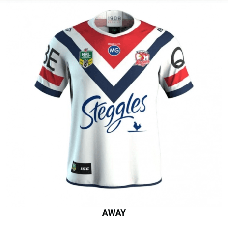
It’s probably Mark Geyer.
Wests Tigers
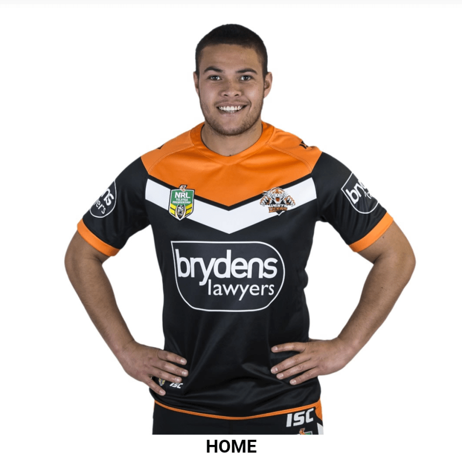
Benji Marshall will most likely bow out wearing this, which just proves that you really should quit while you’re ahead.
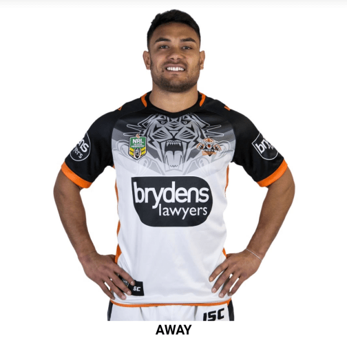
This isn’t helping your case Wests.
Well there you have it folks, all the teams for 2018, bar the Gold Coast Titans who couldn’t even get their kit together for this preview. Hopefully the footy will be more entertaining than the fashions!
