

BY ROB
All of us are familiar with our club logos. They’re the unifying symbol that brings fans together, the passion and frustration of thousands of people compressed into a tiny patch of fabric. We see them everywhere from social media to broadcasts and the apparel that we wear.
Some teams like the Raiders or the Storm have but two designs to their name. Foundation clubs like the Roosters have over a hundred years of designs in their name. Each design tells us something about that club during that era, a little trove of information captured in a few pen strokes and colours.
Throughout this series we’ll examine the evolution of logos. Some articles will be long, charting a clubs emblem from its hand drawn inception in the early 1900s to a digital production in the 21st century. Others, like the Raiders, will be quite short. If you’re looking for history behind each design you may be disappointed – much of this information will have been lost to the depths of time.
We’re also going to exclude designs such as anniversary logos that may not have necessarily made it onto the jerseys of players. To kick things off we’ll start with the reigning premiers Penrith and chart the growth of their iconic big cat from 1967 to 2022.
1967 – Inaugural logo

At first glance you’d think it was a basketball. A panther, heraldic in appearance, solid black with a white outline and highlights leaping through a capital P in red. The leading element is overlaid on a horizontal two-tone shield denoting a football, itself contained within a blue circle encircling Penrith Panthers in red. Perhaps the most intriguing aspect of this first logo is how far removed it is from everything that comes after it.
1978 – Second logo
The 1978 design marks the arrival of some traditional Penrith accents – the earthy brown tones of the encircling shield and a more stylised lunging cat. The designer clearly had an objective here – bring the panther to the fore with a much more detailed illustration while simplifying the previously messy shield design. The panther in mid-air will go on to be the defining element of Penrith’s logo.
1979 – Third logo
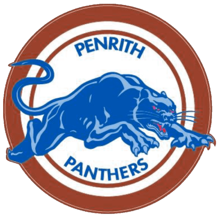
The second logo lasts but a season before it’s refined into the emblem that Penrith will wear across the next eleven seasons. The cat illustration remains but in an augmented light/blue colour scheme (perhaps a nod to the Blue Mountains?) with both it’s eyes and maw rendered in red. The shield has changed too – instead of two parallel bands we now have brown and white rings of varying thicknesses.
1991 – Fourth logo
The first logo to be worn by a Panthers side all the way to premiership glory. The enduring panther remains, but this time it’s two-tone design has switched to black with white highlights (the eyes and mouth remain red). The shield has changed again, now a solid black band encircling a trio of red, yellow and green rings. The text has also been refined to a finer font.
2000 – Fifth logo

The biggest shift in the logo’s history. No more leaping cat, now just a panthers face rendered in black with purple highlights. The yellow eyes are finally restored. The panthers head rests stop a shield that extends down from the heavily stylised PANTHERS, with Penrith in yellow in a little capsule above it. The second of the club’s premiership winning logos.
2014 – Sixth logo
The leaping panther returns after a thirteen year absence. The design has been updated, with multi colour highlights and a more direct glare. “Penrith” has been deleted from the design, with a slightly accented font underlined by the tail of the S in “Panthers”. The blue highlights are a callback to the Third logo (1979).
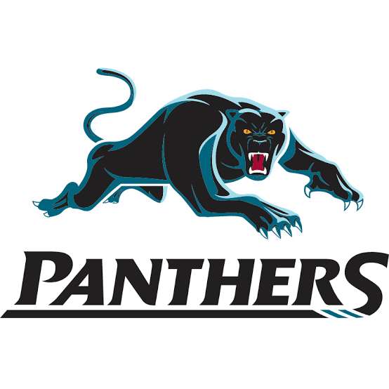
2019 – Seventh logo

The Panthers logo reaches its most minimalist design yet – no text, no shield, just a black panther with stylised two-tone grey highlights, a red tongue and yellow eyes. This design adorns the players jersey during their successful 2021 campaign.
So there you have it! Seven logos over 55 years. The colour palette never strayed too far, and it’s fair to say that the lunging panther has been the integral design element across most of the club’s history. Next time we might pick a side with a few less choices (the Roosters and Rabbitohs are going to be hell to type up!)
If you like the page on Facebook, follow us on Twitter, or share this on social media, Rob will play you some phat beats. Don’t hesitate to send feedback (dan@sportress.org) or comment below.

[…] been over two years since we brought you the first instalment in this series, where we take a look at the evolution of each club’s most cherished IP, the […]
LikeLike