

BY ROB
Another season, another batch of jerseys spanning the sporting fashion spectrum from delicious legacy vibes through to design update disasters. Not all jerseys are captured here as some teams don’t make round-specific strips (or may not have them ready). So without further ado…
Canberra Raiders
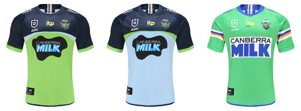
The Raiders have made some interesting choices for 2021. The home strip honestly looks like a top-spec training jersey with the ACT sporting trim relegated to the back. The away strip is somehow even more training day flavours. But the one thing we can all agree on is that the heritage piece is fantastic bit of retro – the pastel lime green, the huge Canberra Milk logo and the mid-arm cuffs all come together in a seamless package.
Brisbane Broncos
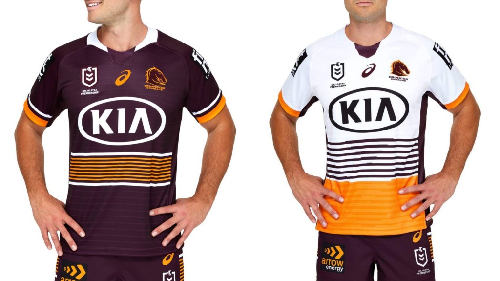
Pretty standard stuff from the Broncos, following the old “if it ain’t broke” mantra, something which they wish would describe their current squad. In case you didn’t know Kia are their major sponsor.
Canterbury-Bankstown Bulldogs
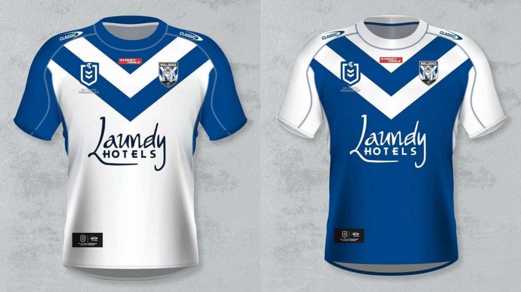
When you can’t be stuffed designing anything: take a vintage design, add some piping to the sleeves then select the whole thing in Photoshop and click invert to get your away strip. I’ve never heard of Laundy hotels and I’m sure I never will again once the Dogs move onto the next sponsor.
Cronulla Sharks
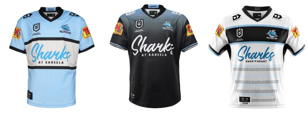
The home strip has strong retro flavours but you know times are tough when your major sponsor is, well, yourself. I don’t half mind the away colours which look like their modelled on the dorsal shades of a great white. The wall of fame on the alternate strip runs 1-350 (Monty Porter to Patrick Gibson).
Gold Coast Titans
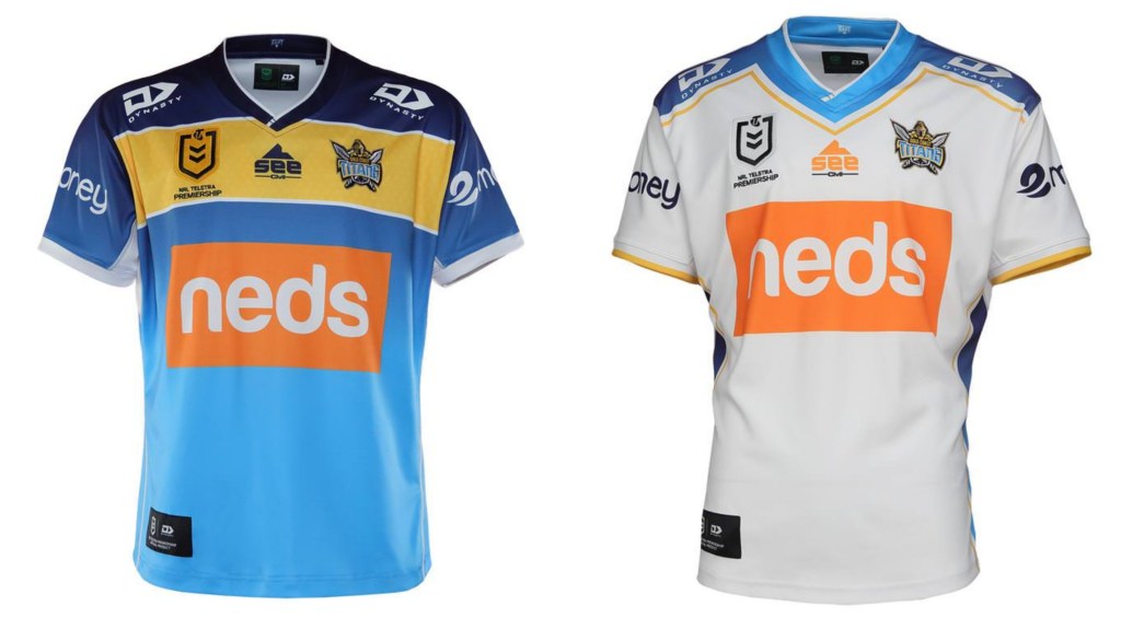
The Titans jerseys answer the question “What is the minimum amount of effort a club can put into the thing it will be wearing across at least 22 games?” The neds logo is jarring and the gold strip (awful design pun) makes the home jersey look like one of those fishing competition tops.
Manly Sea-Eagles
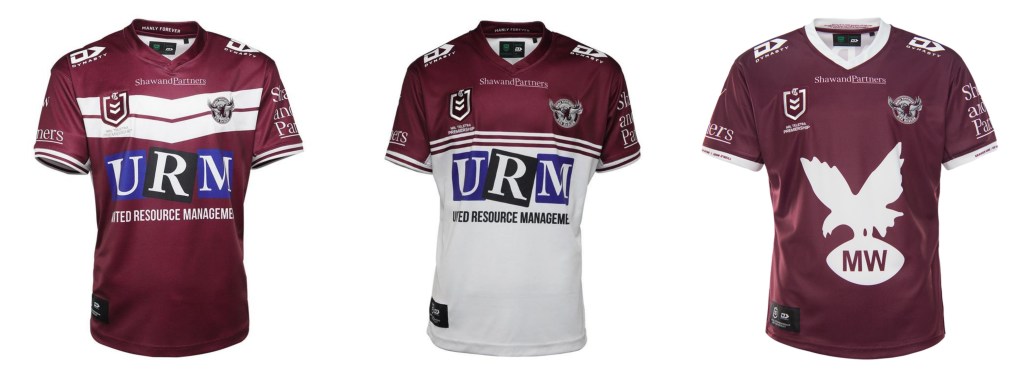
Seriously Manly, find a new sponsor, the garbage firm ain’t working. The best of this trio is unsurprisingly the heritage jersey which plants the (circa) 1964 logo on a plain maroon strip.
Melbourne Storm
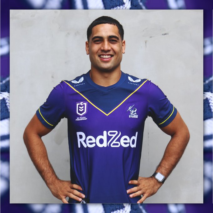
The Storm legit look like they’re cosplaying as the Phantom in 2021 with their home strip (I’m amazed they managed to refrain from drawing muscles on it). I have no idea what redzed is but hey at least it’s not the Crown group.
New Zealand Warriors
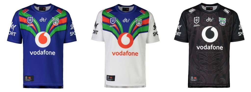
I dig these. The home and away combo are assuredly retro and easy on the eyes. The indigenous strip hits three ticks for somehow managing to be indigenous whilst also looking like a modern club jersey and a NZ test strip. Choice as.
Newcastle Knights
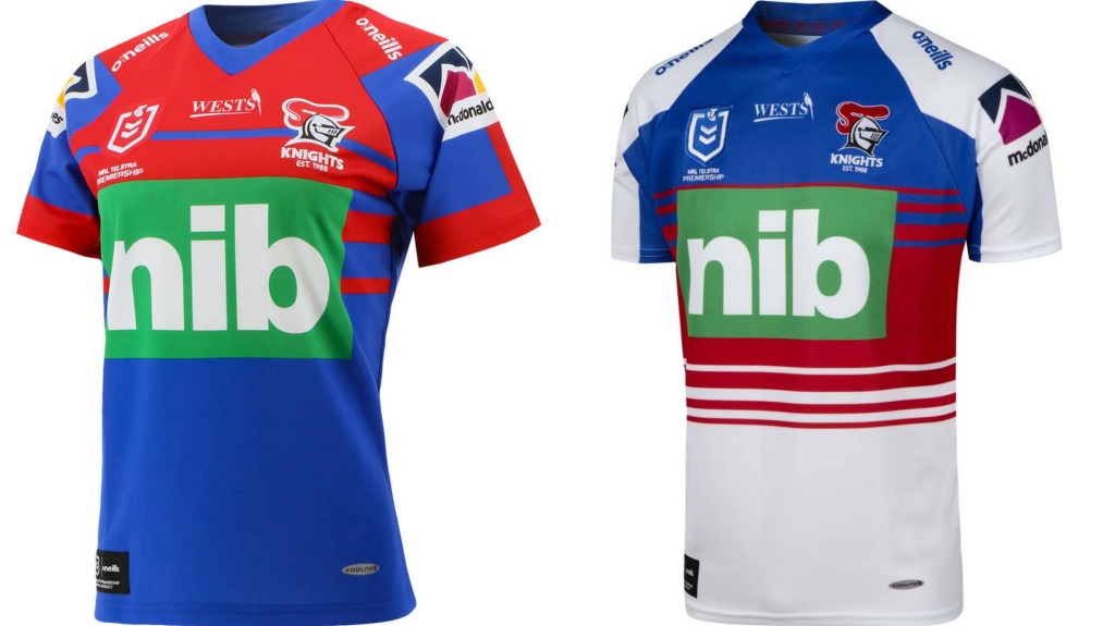
The home jersey certainly screams Newcastle, at least colour-wise. Other than that there’s not much to say about either of these strips, except that hopefully the money saved on design is being used to improve the side in some other way.
North Queensland Cowboys
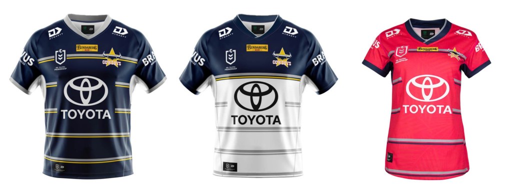
All these jerseys do is remind me how I liked the classic “Cow-horns” design last seen in 2018. Somehow the cows have managed to engineer a home strip that looks like a rejected Eels top. I assume that the hot pink of the WiL strip is derived from the skin tones of severely sunburnt Queenslanders.
Parramatta Eels
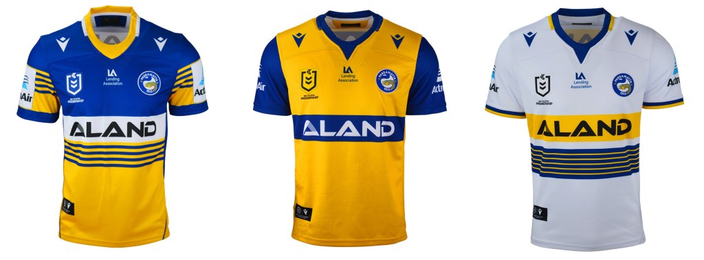
The home strip is left to do all the heavy lifting in this trio, with the alternate jersey a simple (and lazy) inversion in white. But the real WTF MVP is the away Jersey, which quite frankly is a TNT logo away from being a retro referees strip.
Penrith Panthers
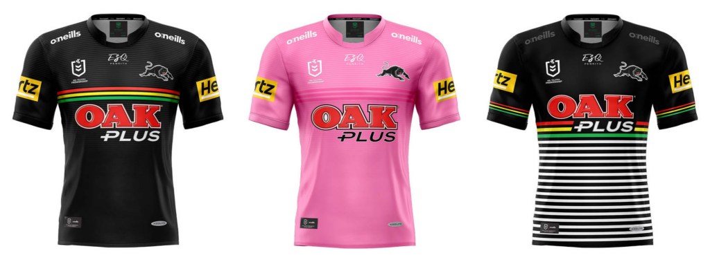
The Panthers home attire screams efficiency, which makes it the polar opposite of anything Gus did for them. Oak have been sponsors for so long they’re practically part of the furniture and I do like that Penrith have decided that their WiL strip is worthy of away status.
South Sydney Rabbitohs
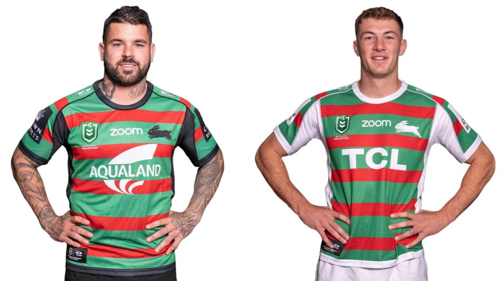
South’s have decided to spice things up by having two different sponsors, which is funny given half the league probably wishes they could find one that’ll be viable long term. Aqualand is a property developer which is arguably the most Sydney thing ever while TCL is a Chinese electronics firm. Everything else about this pair is stock standard Bunnies.
St George-Illawarra Dragons
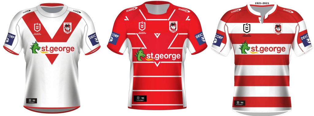
It is impossible to stuff up a Dragon’s home jersey. The red V is an indelible part of rugby league iconography. The design team have clearly had a bet on how bad a jersey can be and still get made which is why the alternate strip is there. The heritage jersey exists purely to remind everyone that the Dragons were unbeatable for nearly a decade in the 20th century.
Sydney Roosters
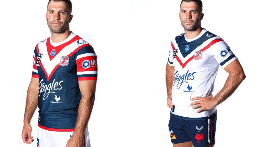
Possibly the most interesting thing about either ensemble is the 70s Roosters logo on the away shorts. Pretty much everything else remains the same (Tri-colour sombrero not pictured).
Wests Tigers
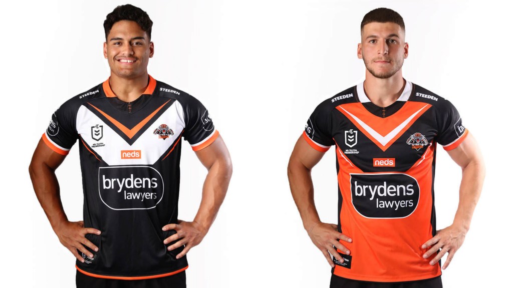
You might think it weird that the home strip for the Tigers is actually more of a Magpies design, but anyone who’s followed club affairs the last few years knows that Western suburbs have all the power on the leagues club side of things (Balmain leagues club nearly went bankrupt). Notable absence of the little magpie which used to adorn the sleeves.
Hi! Do us a solid and like our page on Facebook, follow us on Twitter, or share this on social media. Don’t hesitate to send us feedback or comment below if you think we are stupid. Or if we’re not.
