

By Rob
Howdy folks, it’s been a while since I’ve graced the digital pages of the Sportress, but with the 2026 season bearing down on us and trials already underway, it’s time to once again cast a critical eye across this year’s fashions on the field.
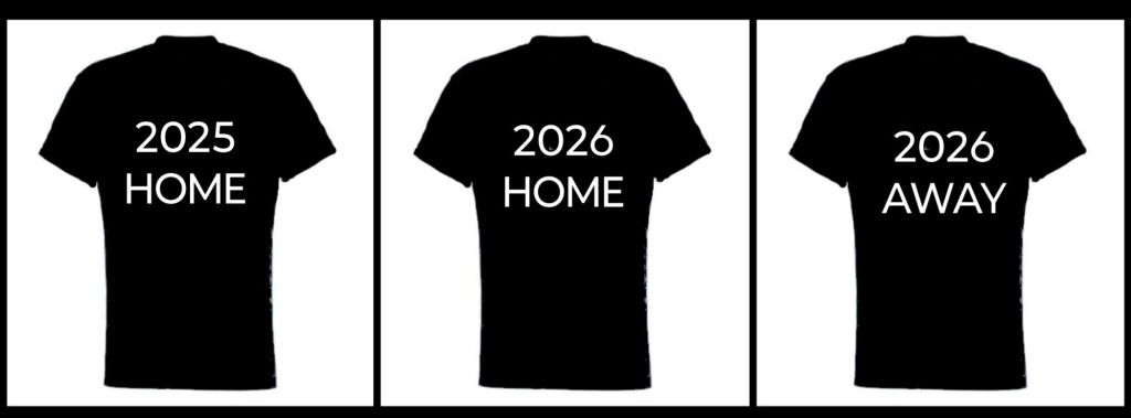
I’m trying something new this year – pairing last year’s Home jersey for each club with their Home and Away strips for 2026 so you can see what changes, if any, have taken place.
The layout is as follows:
So without further delay let’s see what the 17 clubs will be rocking as they battle it out in 2026!
Brisbane Broncos
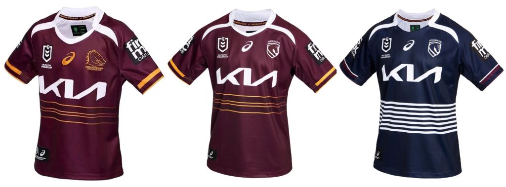
The reigning premiers have made a few subtle changes this year. The inverted white horns coming down from the collar have been narrowed and extended slightly, whilst the ASICS logo and the Broncos new chess-style insignia are rendered in white instead of the classic gold hue. Perhaps the biggest change is the away strip – after last year’s bizarre PE Teacher getup the Broncs have opted for a minimalist flat dark blue design.
Canberra Raiders
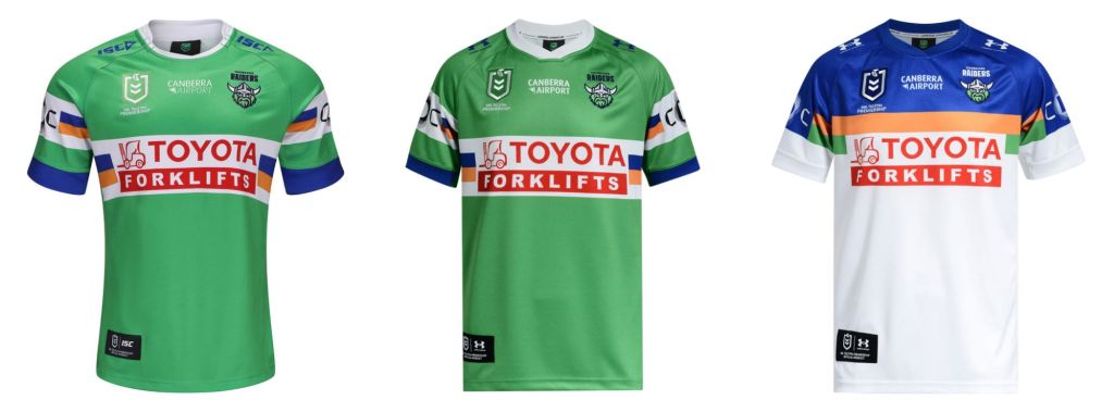
At first glance not much has changed for the Milk in ’26, but there have been some subtle adjustments made to last year’s design. The green appears slightly darker (although this may be due to studio lighting choices). ISC have made way for new apparel sponsor Under Armour, and the NRL and Raiders logos have both been given a touch of contrast so they stand out better. If it ain’t broke, don’t fix it – just tweak it.
Canterbury Bankstown Bulldogs
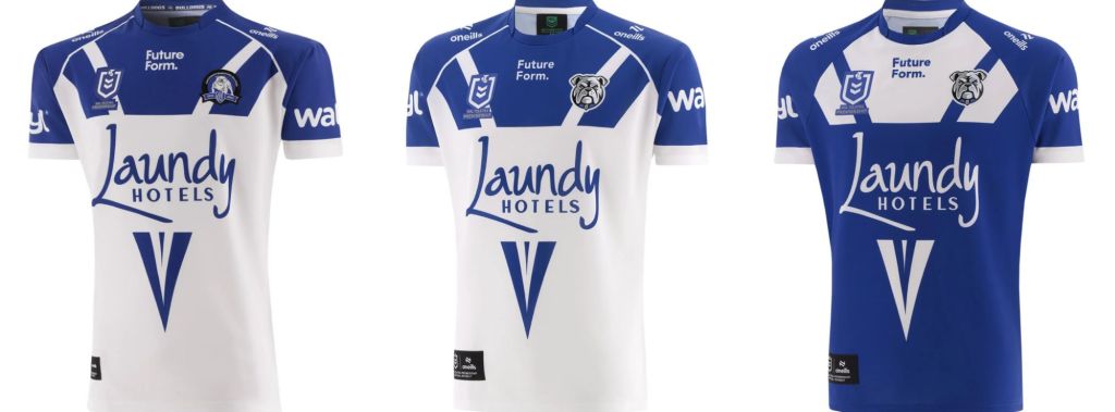
The Doggies have made adjustments so minor you have to squint and look twice to register them. The sleeve sponsor has been elevated for a bigger gap between it and the cuff. Apart from that the only other discernable change is the new logo, with the club shifting from its classic full-body bulldog to a new bulldog portrait.
Cronulla Sutherland Sharks
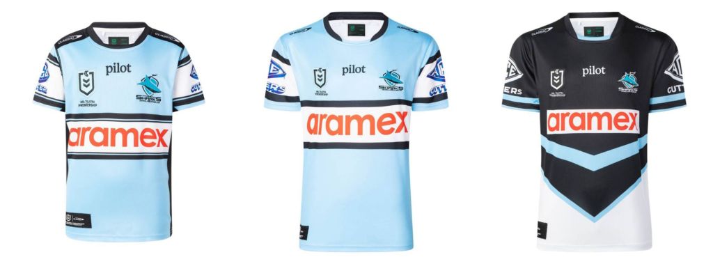
The Sharks too have made only minor tweaks. They’ve deleted the black bars running from the collar to the shoulders, and the bars bordering the main sponsor have been simplified to two black lines. The pilot logo has been brought down to be roughly in line with the NRL and club branding, which in turn helps to open up the visual area of the upper torso. Streamlined, like a shark.
The (Redcliffe) Dolphins
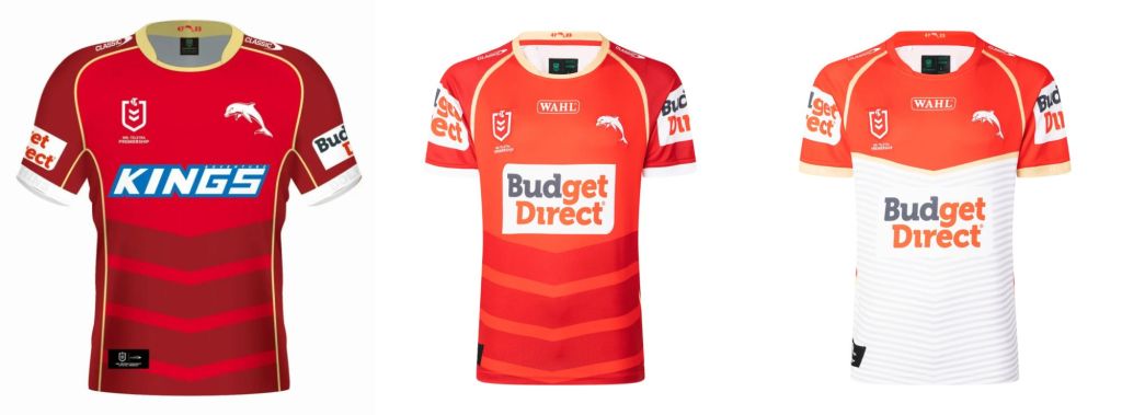
The NRL’s newest outfit have gone lighter and brighter this year. Last year’s sponsor Kings have made way for Budget Direct who now monopolize the primary and sleeve spots. The torso chevrons have faded, while Wahl has been added as a very low collar sponsor, pushing the NRL and club logos out to the edges of the chest. Time will tell whether or not fans will give this iteration the Phins Up of approval.
Gold Coast Titans
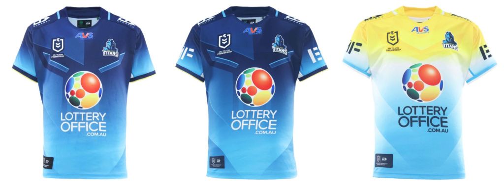
The Titans strip remains lost in the wilderness. Apart from a few tiny tweaks the only noticeable addition is the new sleeve sponsor. At some point the club needs to embrace the gladiatorial theme of its name and logo – then we might be entertained.
Manly Warringah Sea-Eagles
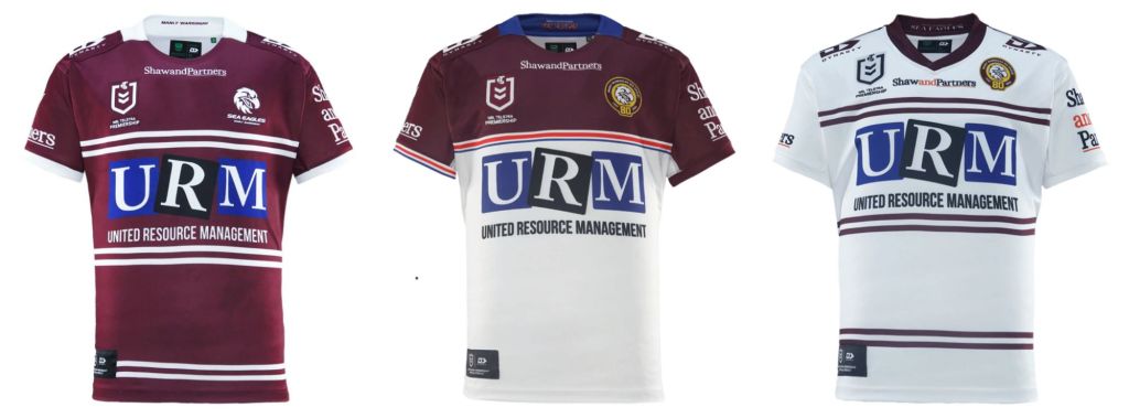
The Silvertails are celebrating their 80th anniversary this year and they’re marking it with a bit of an overhaul. Out with the maroon and double hoops, in with a torso of white capped by an upper of maroon, the two segments separated by a red and blue line reminiscent of the jerseys from the mid ’90s when Pepsi were the main sponsor. The club logo this year is bordered by a gold outline commemorating 80 years.
Melbourne Storm
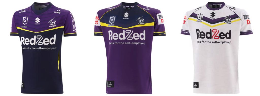
Whoever’s designing the Storms jerseys is laughing all the way to the bank. Simply invert last year’s colour scheme, thicken the two straight bolts on the chest and voila! The vertical lightning bolts running down the torso have been deleted, with smaller horizontal bolts added to the cuffs. The away jersey eschews the flat bolts in favour of a very shallow chevron. Budget direct have taken up residence on the sleeve, so they clearly have money to burn in marketing to the NRL fanbase given they’re also onboard with the ‘Phins.
New Zealand Warriors
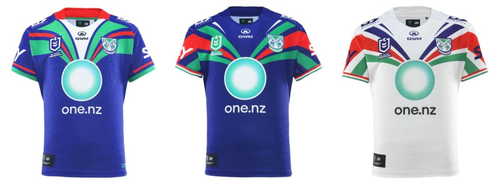
Ahh the Wahs. One of the best jerseys in recent times gets even better. The colour accents now run all the way from the main logo to the sleeve cuffs and the white drop from the collar has been switched to the primary blue, giving the whole thing a more cohesive look. Keen to see this one in action come round 1.
Newcastle Knights
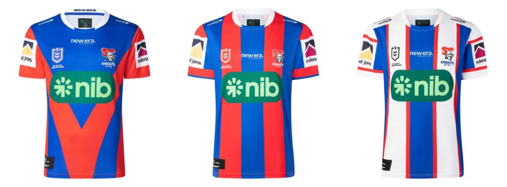
The novocastrians have decided to regress in 2026, hence this awful choice of vertical stripes that make them look a bit like a circus tent. If the 2025 jersey conveyed a sense of urgency with its giant red v the new one conveys a sense of those old-timey changing huts at the beach circa 1910.
North Queensland Cowboys
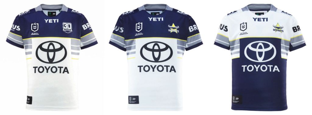
Yet another to file under minimum effort, maximum rollover. The logo reverts back to the standard design now that it’s no longer an anniversary milestone, but everything else speaks of a design team waiting for inspiration (and quite possibly Godot as well). The away strip does the basic trick of upending the colour scheme.
Parramatta Eels
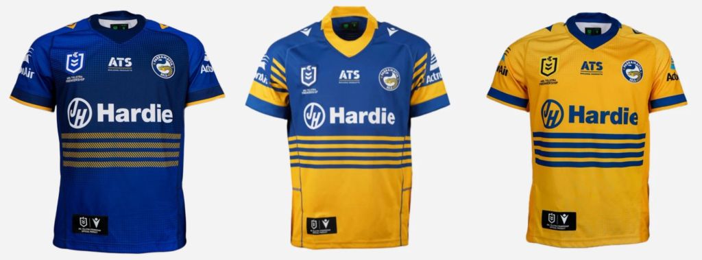
The Eels had a divided reception to their ’25 jersey, with club diehards praising the nostalgia bomb whilst others found the reunification of the Blue & Gold with the purveyors of asbestos at James Hardie on the nose. This year’s Home strip reverts to the two-tone colour blocks divided by stripes and clearly draws inspiration from the triumphant jersey of 1986.
Penrith Panthers
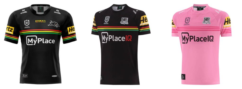
The Panthers unrivalled dominance of the NRL finally came to an end last year, but that doesn’t mean they’re going to ditch the threads that have adorned them during their golden reign. Much like Manly the Riff are celebrating a milestone, with the standard logo replaced by a 60th anniversary device. MyPlace is now MyPlace IQ (whatever that means) while Allam has departed its below-collar position.
South Sydney Rabbitohs
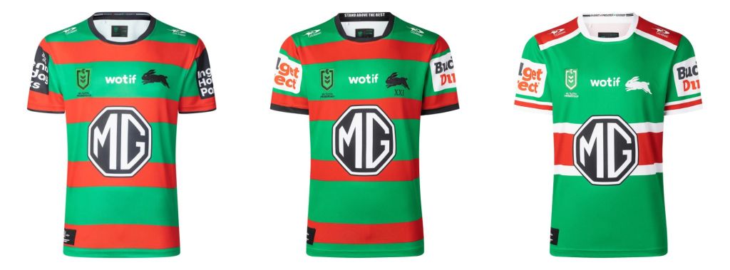
The Bunnies have mostly kept things same-same for this season – a smidge of black trim on the sleeve cuffs is the only real change. The hydra that is Budget Direct rears another head, commandeering the sleeve sponsor spot. Maybe they can insure Souths against a repeat of 2025.
St George-Illawarra Dragons
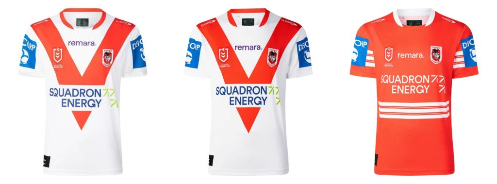
The Dragons have clearly decided they have bigger problems than jersey designs in 2026. The iconic Red V is just that bit longer, but apart from that it’s business as usual for the merged ones.
Sydney Roosters
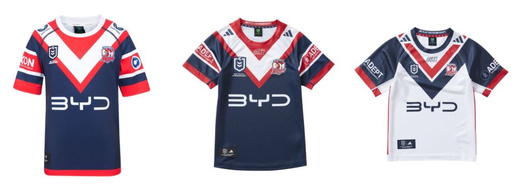
Of all the clubs the Roosters have been the most reticent to unveil their new strip, to the point where the only decent photo of their away jersey is of the infant/junior sized apparel. On the home side of things there have been alterations. The red hem is gone and the cuffs have been reduced. The sleeve sponsor has changed from one interminable firm to another.
Wests Tigers
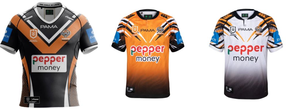
The words of Phil Gould spring to mind when looking at the Tigers new garb in 2026: “Dear oh dear oh dear”. From a messy off-season to a mess of a jersey, the misery of the West continues apace. Nothing looks good here, not the weird fade to black across the lower third, or the bizarre tiger stripes that gallantly try to work some magpie style into the kit but fail. The away strip has the honour of somehow looking worse than the home one.
So there you have it, all 17 clubs in their new (or in some cases not so new) adornments for the 2026 premiership.
If you’re interested in the evolution of jerseys go and check out the Rugby League Jerseys website – an excellent treasure trove indeed.
I’ll be back this week with the first trial Rumble. Until then – Up the Milk!
The Sportress is transitioning away from Facebook and Twitter for distribution so sign up to the email below before we disappear from your feed altogether. Don’t hesitate to send us feedback (dan@sportress.org) or comment below if you think we are stupid. Or if we’re not.
