

BY ROB
The jersey roundup has crept up on me this year. My job involves a lot of driving, and this Monday just gone I was filling time by listening to the latest Green Machine Podcast. As Mike and Dan sifted through each team’s prospective chances something stirred in the back of my mind – JERSEYS! A quick google later and I’m ready to give you the rundown on the kits each club will be rocking across the 2024 season. Buckle up!
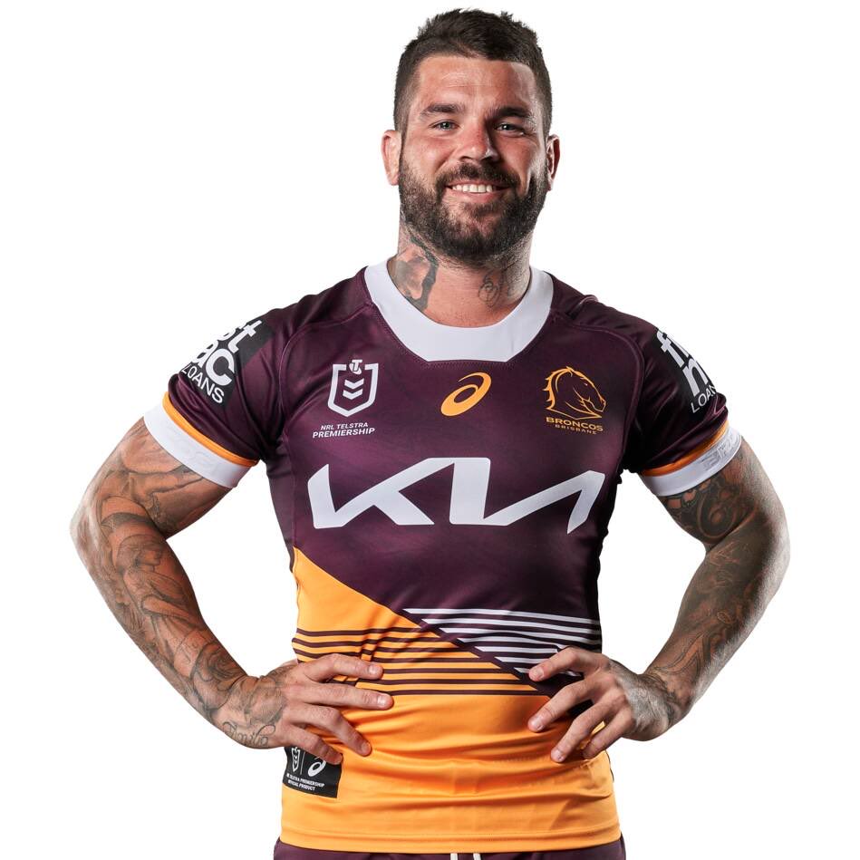
Brisbane Broncos
Last year’s runners up have decided to stay the course with their home jersey, with a “If it ain’t broke don’t fix it” attitude. The same cannot be said of their away kit, which screams “enthusiastic P.E teacher”. Collars are a really weird choice in this day and age.

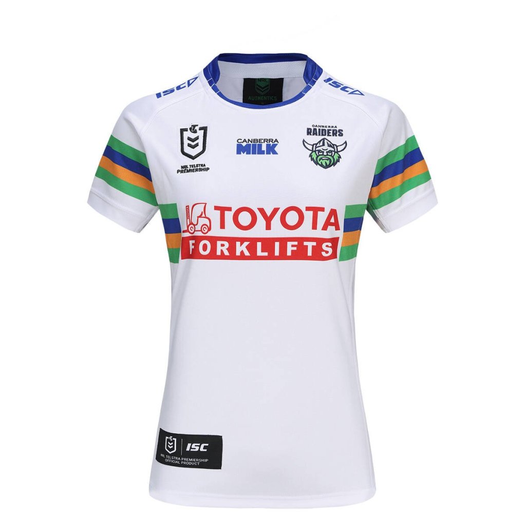
Canberra Raiders
The Green Machine have offered up yet another solid block of mild lime for you to rest your eyes upon. The Raiders have embraced the jersey brief of ’24, which apparently just said “Change nothing”. The away jersey is so white you could use it as teeth whitener.

Canterbury-Bankstown Bulldogs
If tinkering around the edges was an art form the Doggies jersey designer would be up for an award. As far as I can tell the only changes are a lighter shade of blue, a thicker block of colour around the collar and some piping for definition. Ditto for the away jersey. Given how much they need to focus on footy over fashion it’s probably for the best.


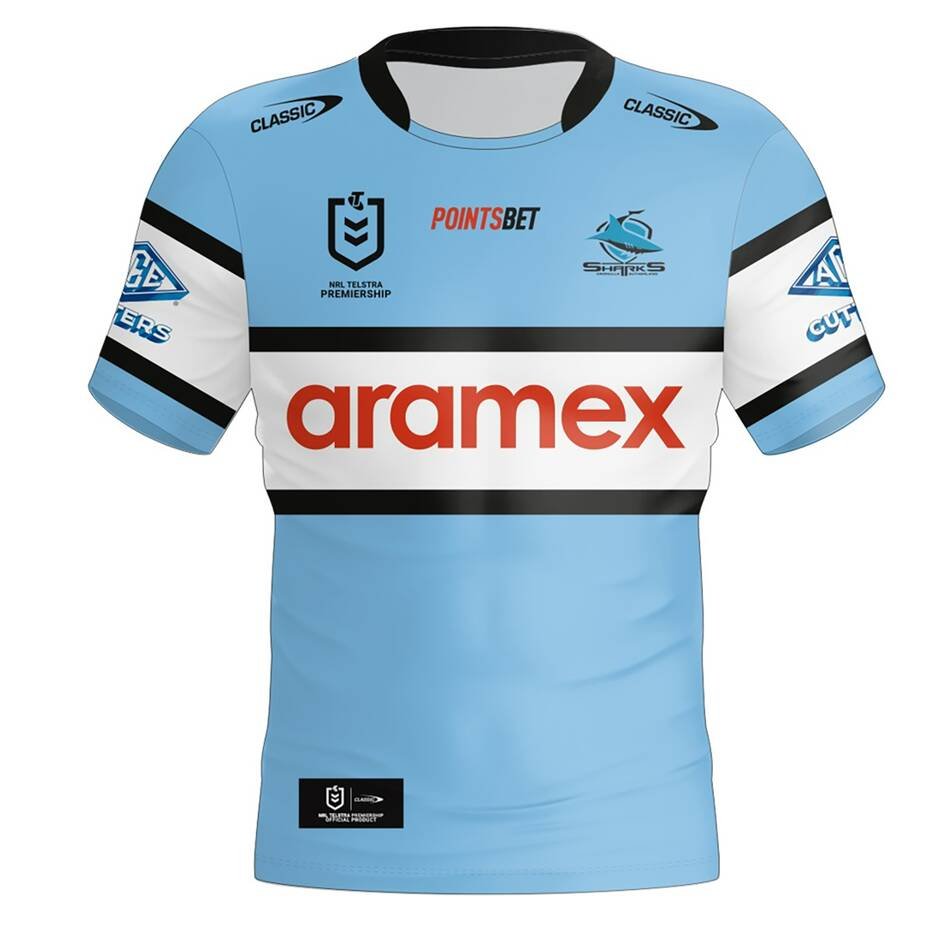
Cronulla-Sutherland Sharks
The NRL’s flat track bullies are back with a brand new strikingly similar jersey to the one they wore last year. Once again the Sharks are partnered with one of the worst courier companies around, a relationship manufactured in corporate hell.

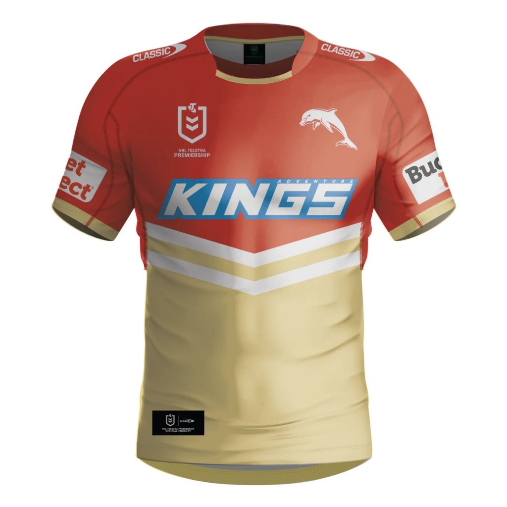
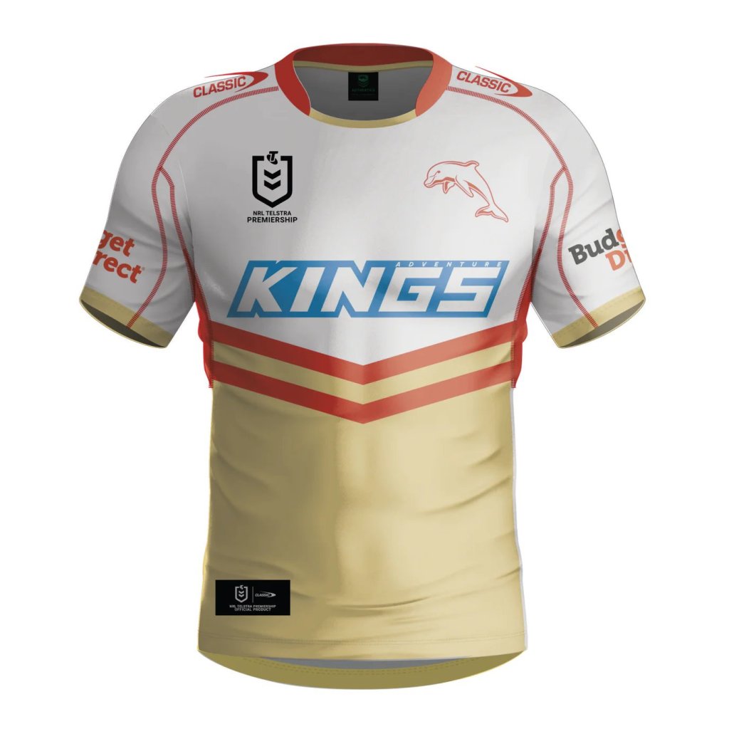
The (Redcliffe) Dolphins
Everyone’s favourite footy playing cetaceans return for their sophomore season rocking what appears to be exactly almost the same strip as last year, but like half of the entries in this article they managed to Photoshop in near-perfect abs. While their home and away jerseys still look like someone put half of the vanilla coke on the shelves upside down, their alternate strip looks deadly AF.

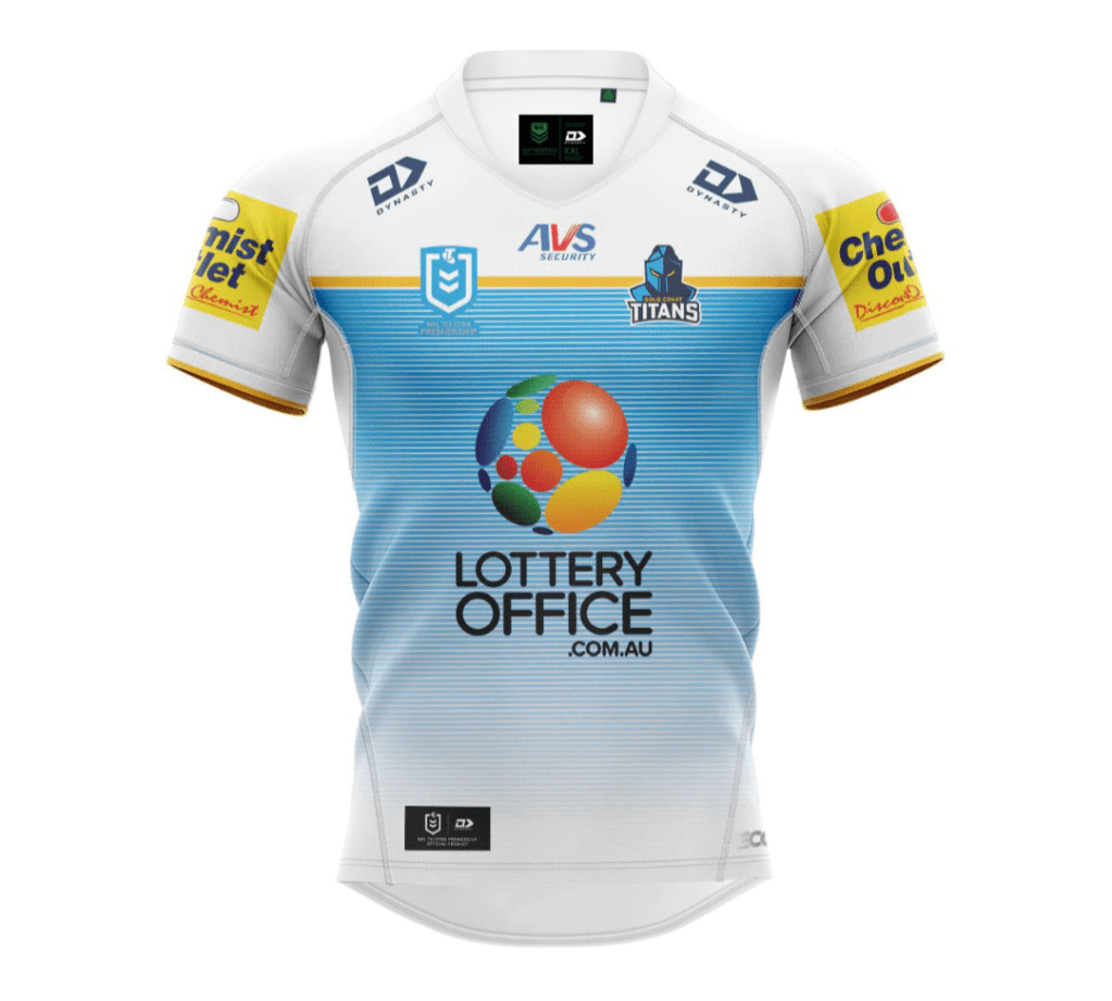
Gold Coast Titans
The Titans have achieved the impossible – making their dire 2023 jersey worse. If you thought teaming up with predatory money lenders was in bad taste wait until you get an eyeful of the lottery logo plastered across one of the most lack-lustre designs in the comp.

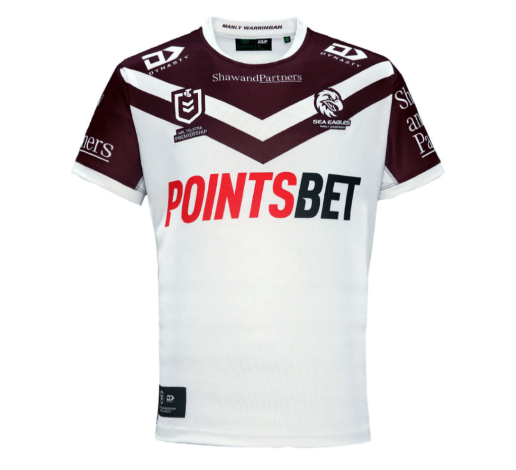
Manly-Warringah Sea-Eagles
The design team at Manly have raided the club classics – the hoops motif has been the most dominant throughout their history, while the V/chevron adorned their first ever jersey. Hopefully they ran all these past the playing group to make sure they weren’t “sinful” in any manner (Gambling corporations as primary sponsors not withstanding).

Melbourne Storm
Imagine if your theoretical nephew won a competition to design the Storm jersey and had just enough graphic design nous to put it together, but not the actual taste to make it good (I say nephew because no niece would ever serve this up). The home jersey looks like it’s just turned up to clean your pool or AC.


New Zealand Warriors
I legit like this jersey, which is why I won’t dunk on it for being a re-run of the 2023 effort. Extra points for finding a sponsor that a) doesn’t have a red logo and b) integrates nicely with the strip, giving them a kiwi-Ironman vibe.


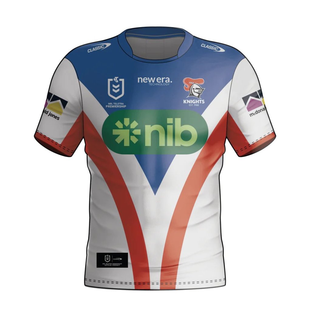
Newcastle Knights
I’m afraid I’ll have to mark the Knights down this year for going against the grain and changing their design too much (jokes). Out of all the sides the Novocastrians have made the biggest shift, ditching last year’s flat chevron pattern in favour of dual curves that drop down. The away jersey also works well.

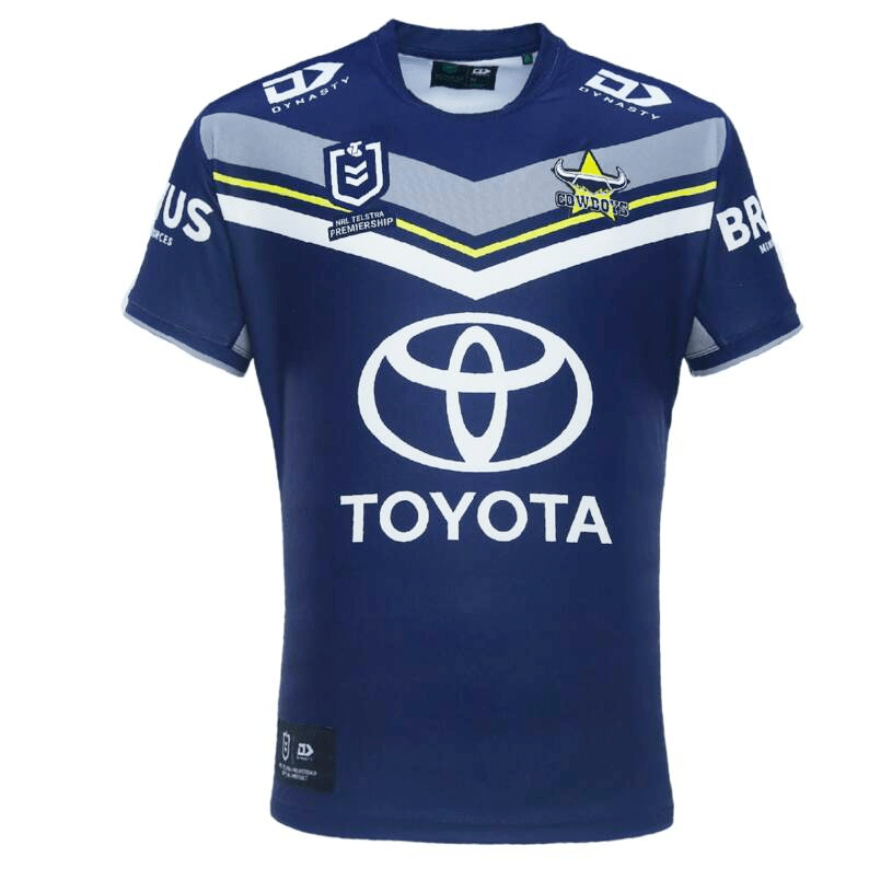
North Queensland Cowboys
At the opposite end of the effort spectrum we have the Cowboys, who have courageously *checks notes* moved their logo by a few millimetres. I guess what they saved on the redesign they can spend on getting better at footy.

Parramatta Eels
The Eels have clearly heeded last year’s criticism of the weirdly eroded hoops and have opted instead to have each player run over by a perfectly aligned tyre. Weird kink, but totally theirs to own. The unfinished hoops haven’t been completely vanished, as they now reside on the away jersey.


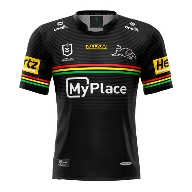
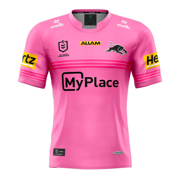
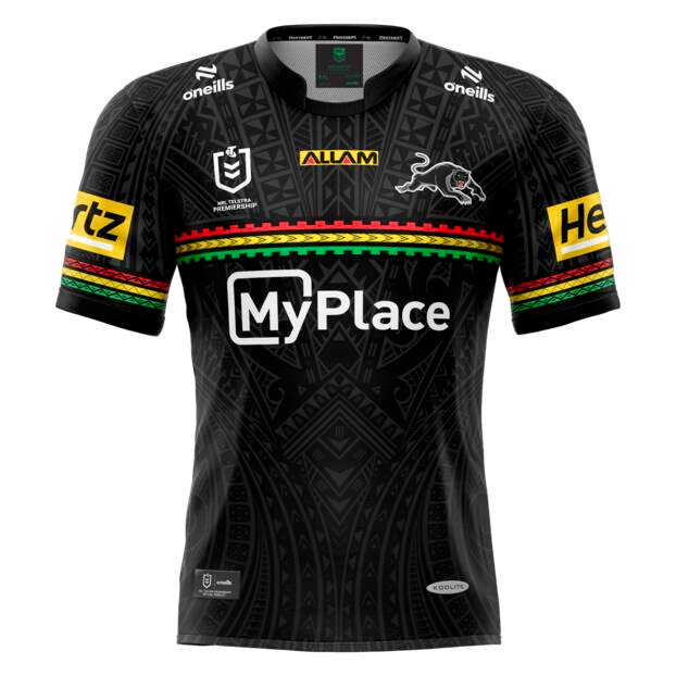
Penrith Panthers
When you’re the three-peat reigning premiers you can do whatever the hell you want, which is why the Panthers have opted to do sweet bugger-all (apart from switching main sponsor). Their alternative pink strip is now so bright all other pink teams anywhere in the world pale in comparison. They’ve also opted for a modified home strip with Pacific Islander style motifs on the piping and upper chest. Lousy stupid excellent team.
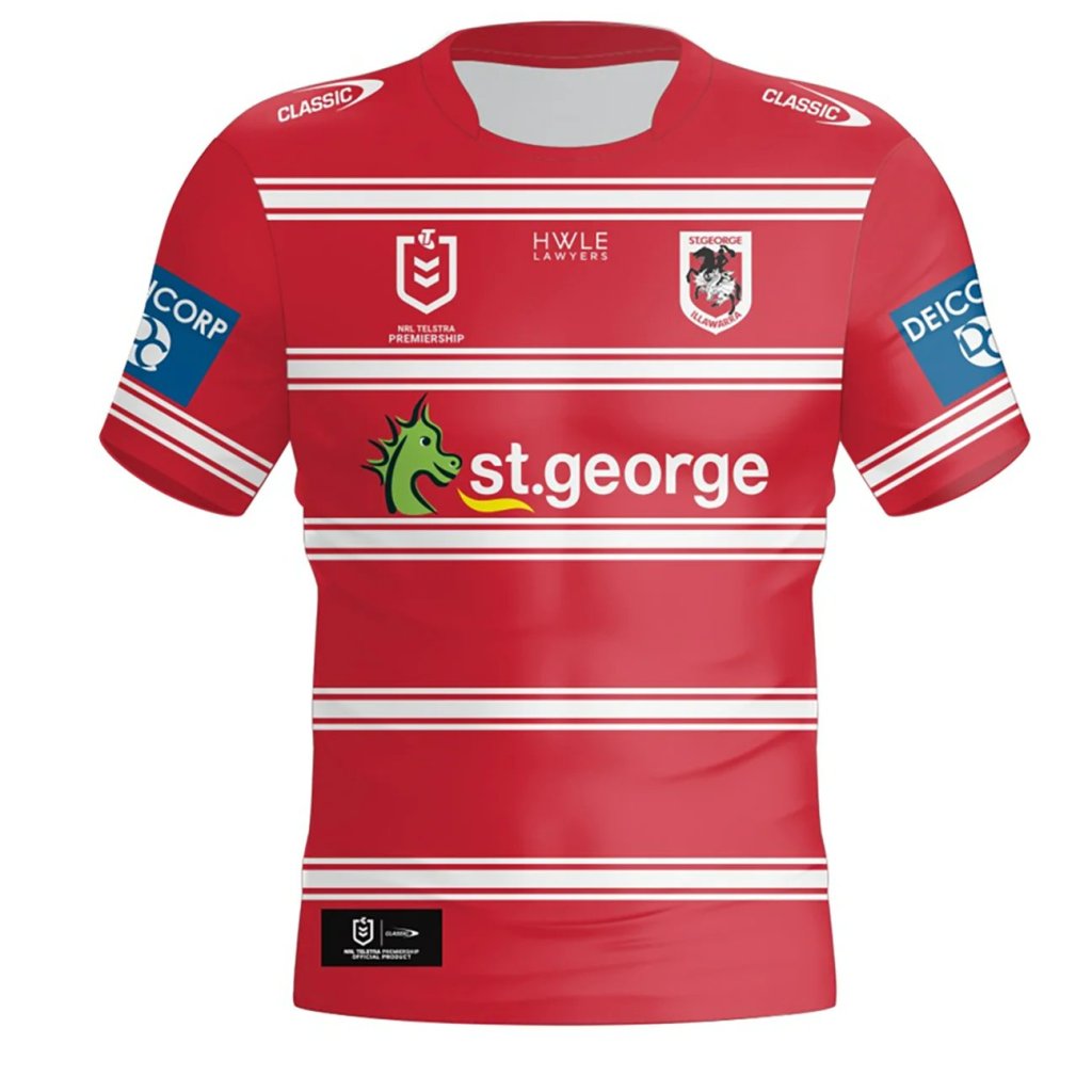
St George-Illawarra Dragons
Fun fact: I had to re-crop the Dragons home jersey because it was so poorly formatted it had a portion of the sleeve from the back view protruding into the front view. I feel like this is an apt analogy of this hapless side in recent years.

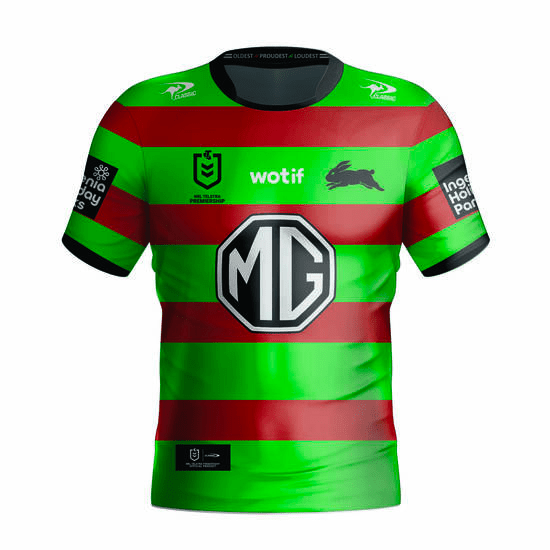
South Sydney Rabbitohs
The easiest way to distinguish the Bunnies two nearly identical strips apart is the MG octagon – a white border and lettering means you’re at home, a black border and lettering means you’re on the road. The real change the Bunnies need this year is their ultimate ladder position.

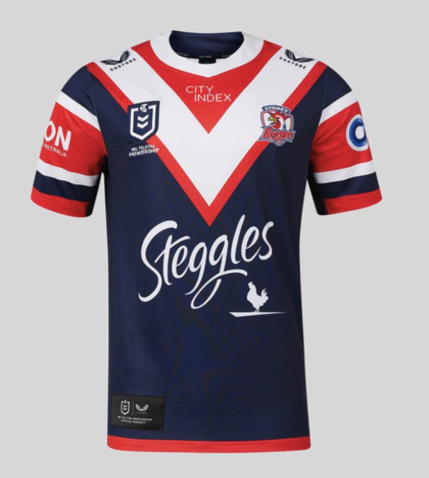
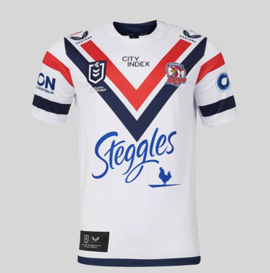
Sydney Roosters
Chevron/V – tick. Three colours – tick. The very sight of it induces rage in non-Roosters fans – extra big tick.
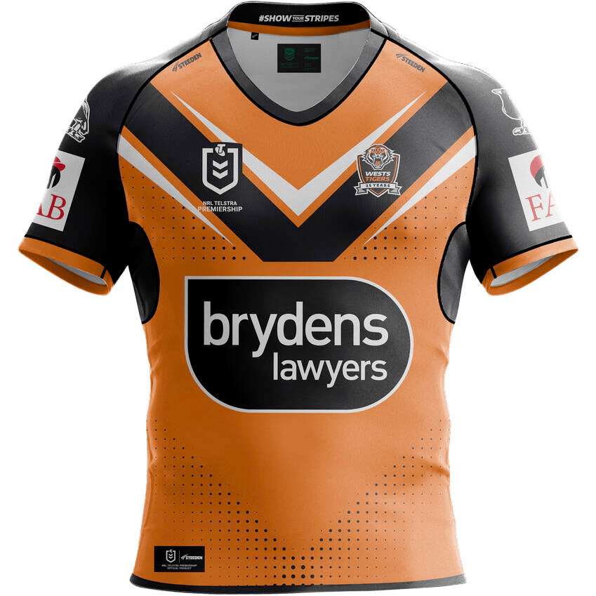
Wests Tigers
The Tigers ’24 strip is already off to a cracking start, mainly by not being the 2023 incarnation. One can only assume last year’s iterations were all burnt in a massive bonfire after the dismissal of the previous board and CEO.

So there you have it – seventeen clubs and their (sometimes not so) glorious attire. Which one will stand atop the GF podium, and which ones will be relegated to the landfill of NRL fast fashion?
You can follow Rob on Twitter here. Or you can do us a solid and like our page on Facebook, or share this on social media. Don’t hesitate to send us feedback (dan@sportress.org) or comment below if you think we are stupid. Or if we’re not.
