

BY ROB
Welcome to 2025, the year of the Raiders 4th premiership. Before we cover ourselves in glory we must first peruse what the Raiders and the 16 other sides intend to cover themselves in as they do battle across the coming season. Has anyone made a substantial design shift? Has a key sponsor been replaced? Let’s find out!
Brisbane Broncos
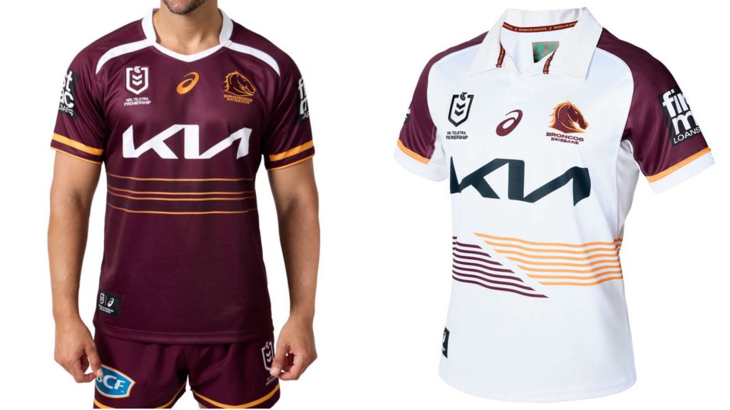
Ah jeez, you got the A-League look and everything. Those two racing stripes across the torso are pretty sharp. Look at me, I’m the Broncos jersey designer from gumdrop land, making everyone happy with my minimal designs (by the way I was being sarcastic). It’s nice to see that they’ve held onto the P.E teacher style for the away jersey.
Canberra Raiders
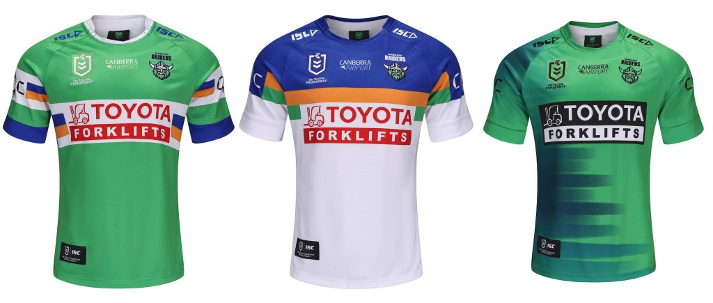
Home jersey: Yes. Away jersey: Also yes. Alternate jersey: looks like it got fed into a fax machine sideways. If only they could transplant the black and white Toyota logo onto the other two. Still, a pretty good strike rate!
Canterbury-Bankstown Bulldogs

The Dogs have gone with a much sharper, plunging V for their home strip in 2025, with the Laundy logo block bisecting it rather than sitting underneath. They also switched the arm panels from white to blue. The away jersey chevron/V now reaches all the way up and onto the shoulders, with both jerseys sporting the 90th anniversary logo. Pretty tidy!
Cronulla-Sutherland Sharks
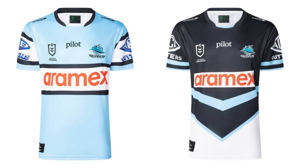
Changes for the Sharks home strip have been minimal to almost non-existent. The blue might be a slightly lighter shade, and Pointsbet have been bumped from the secondary sponsor spot to make way for pilot (maybe they can kick taller bombs this year). The away jersey has done away with the white bar in favour of a V sash midriff thingy.
Gold Coast Titans
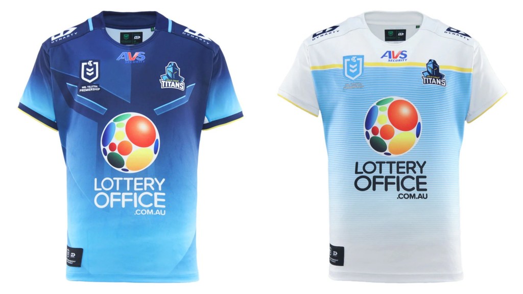
Honest to god what are these jerseys? The home strip is an underwhelming mess, its faintly faded blue hues dominated by a truly awful primary sponsor. The away jersey is even more meek, and looks more like a local soccer club than anything else.
Manly-Warringah Sea Eagles
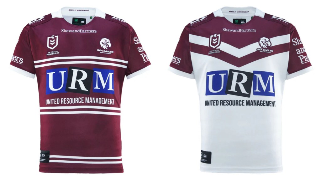
At least Manly managed to find two distinct but cohesive designs. The URM logo still looks like the skilled block work of a one year-old.
Melbourne Storm
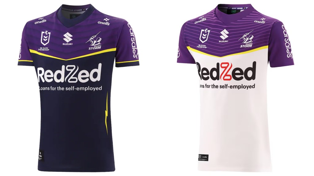
What even is this? Why so little purple? Why have the vertical lightning bolt there, instead of putting it as the dividing element between the purple chest and black/white torso? Why, Melbourne, why?
Newcastle Knights
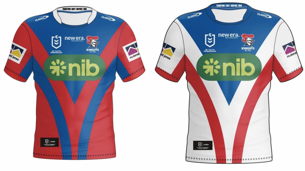
I kinda dig it. The Knights colours are all present, and the design is uniform across the pair. Even the nib logo ties in, given their long relationship with Knights legend Paul Harragon.
North Queensland Cowboys
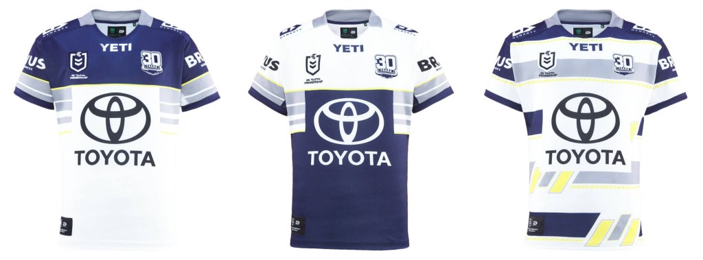
Yeah the Cows designers really went, uh, all out this year, huh? Take one blue jersey and one white, cut them in half and voila! Job done. At least the Toyota logo isn’t another giant red eyesore. They also have a 30th anniversary strip, complete with yellow quotation marks.
New Zealand Warriors
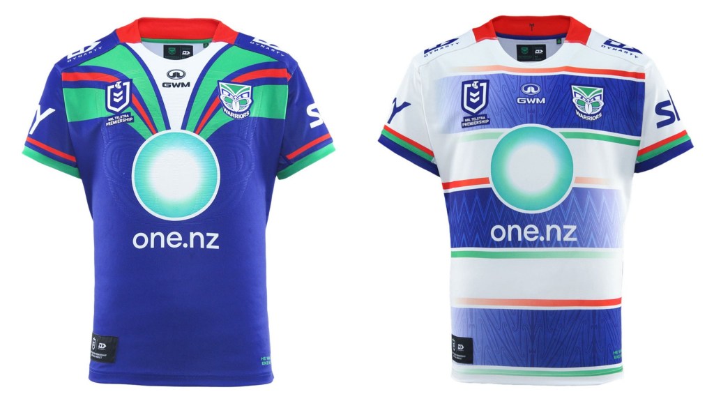
YES. The Wahs strips remain one of my favourite non-Raiders ensembles. You get heritage with the Auckland era colours, two distinct styles and a main sponsor that pairs well on either jersey. Plus Shaun Johnson is no longer around to terrorise us while wearing them.
Parramatta Eels
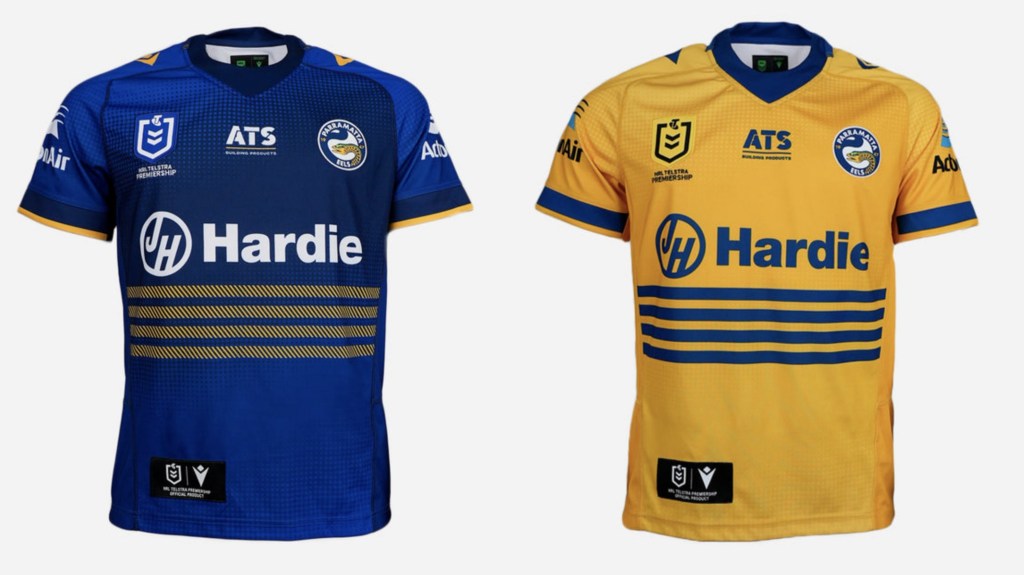
Bernie Banton is an Australian hero. The Parramatta Eels are not.
Penrith Panthers

Are these the strips that will be triumphant at year’s end, or will they be adorning a Panthers outfit that finally finds the breaking point of salary cap attrition. There’s also a black and gold number looks like someone going to court in 2003, but you’re allowed to do that kind of thing when you’ve won four straight comps. Regardless of outcomes Liam Martin’s head is still too big.
South Sydney Rabbitohs
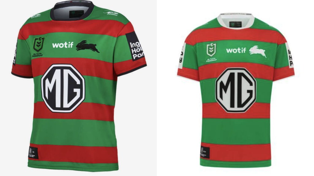
Wotif we just inverted the black and white of the logos, putting in the least effort possible? Really cutting edge stuff from the Bunnies.
St George-Illawarra Dragons
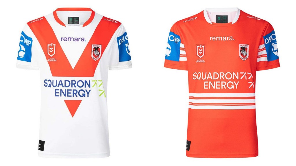
The sun rising in the east. Death. Taxes. The Dragons going with a big red V design. I do love the away jersey though, a homage to the Illawarra Steelers strips of the late ’90s.
Sydney Roosters
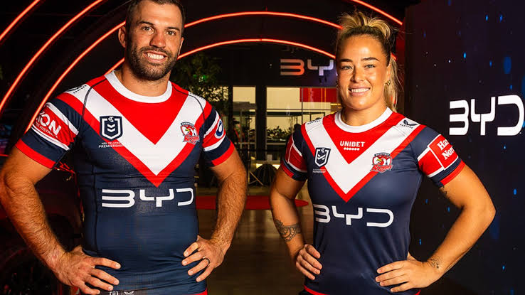
Perhaps the biggest news/change across all 17 clubs is the dethroning of Steggles. The chooks are no longer sponsored by uncooked chooks, instead choosing to partner with Electric Vehicle giant BYD from China. The actual jerseys appear to have been simplified, with strong blocks of colour and minimal detailing.
The Dolphins
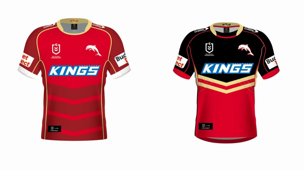
I’m on board for this pairing. While we all ridiculed the ‘Phins initial jersey offerings for looking like various flavours of coke these two strips have a much sharper look.
Wests Tigers
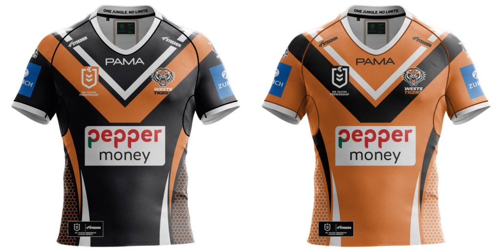
It’s better (I think) than some of their recent efforts, although the switch to pepper money had me thinking they’d taken up with a payday lender (Pepper is some sort of modern home loan outfit). Given that we’re continuously inching closer to a Magpies/Balmain divorce this could be the last ever Wests Tigers strip, making it technically critically endangered.
Sign up the mailing list because the algorithm hates the Milk as much as the Sydney press. Also like our page on Facebook, follow us on Twitter, or share this on social media and believe in the future with me. Don’t hesitate to send us feedback (dan@sportress.org) or comment below if you think we are stupid. Or if we’re not.
